
Sungkyunkwan University Kingo 2026 Winter
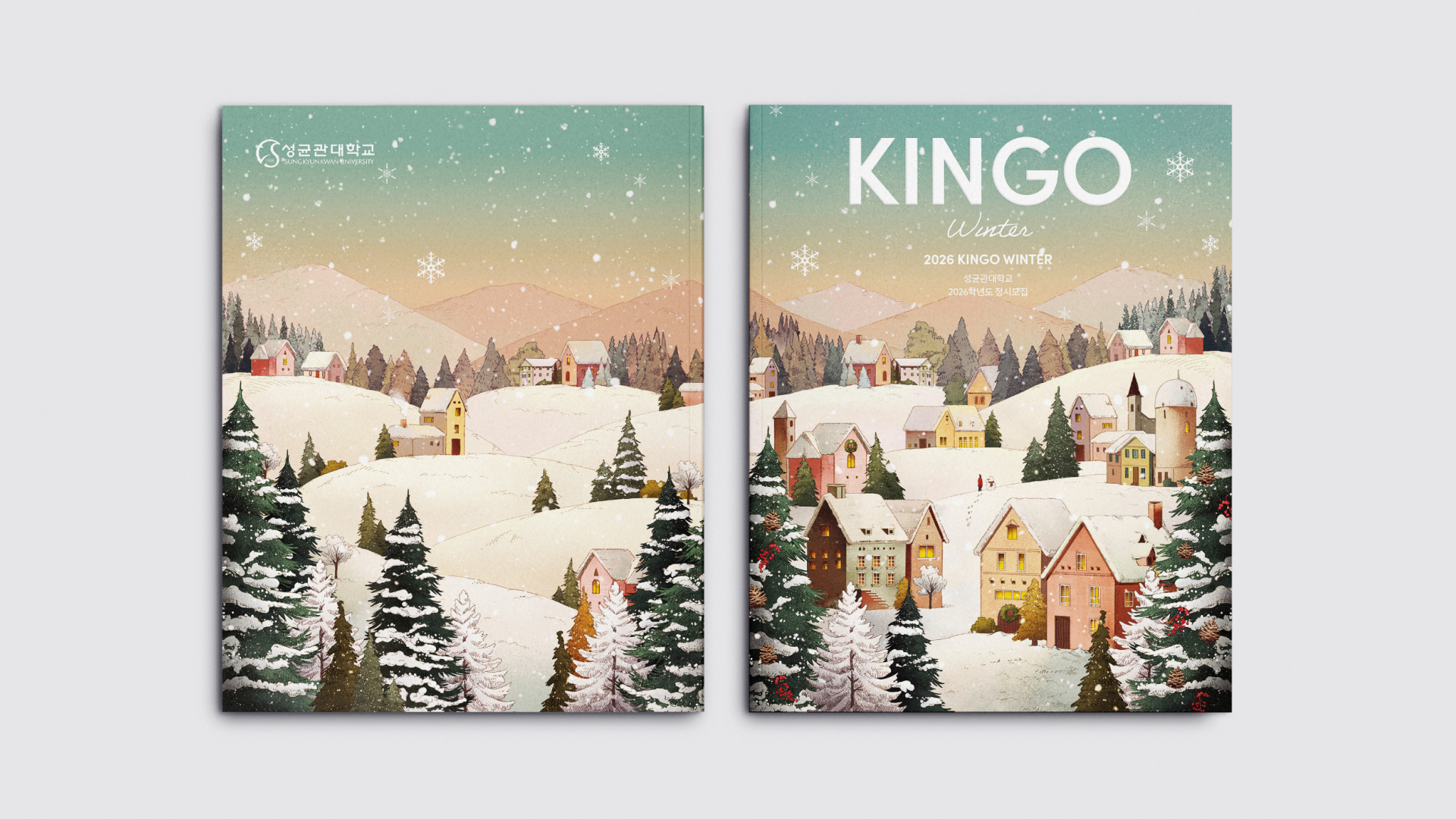
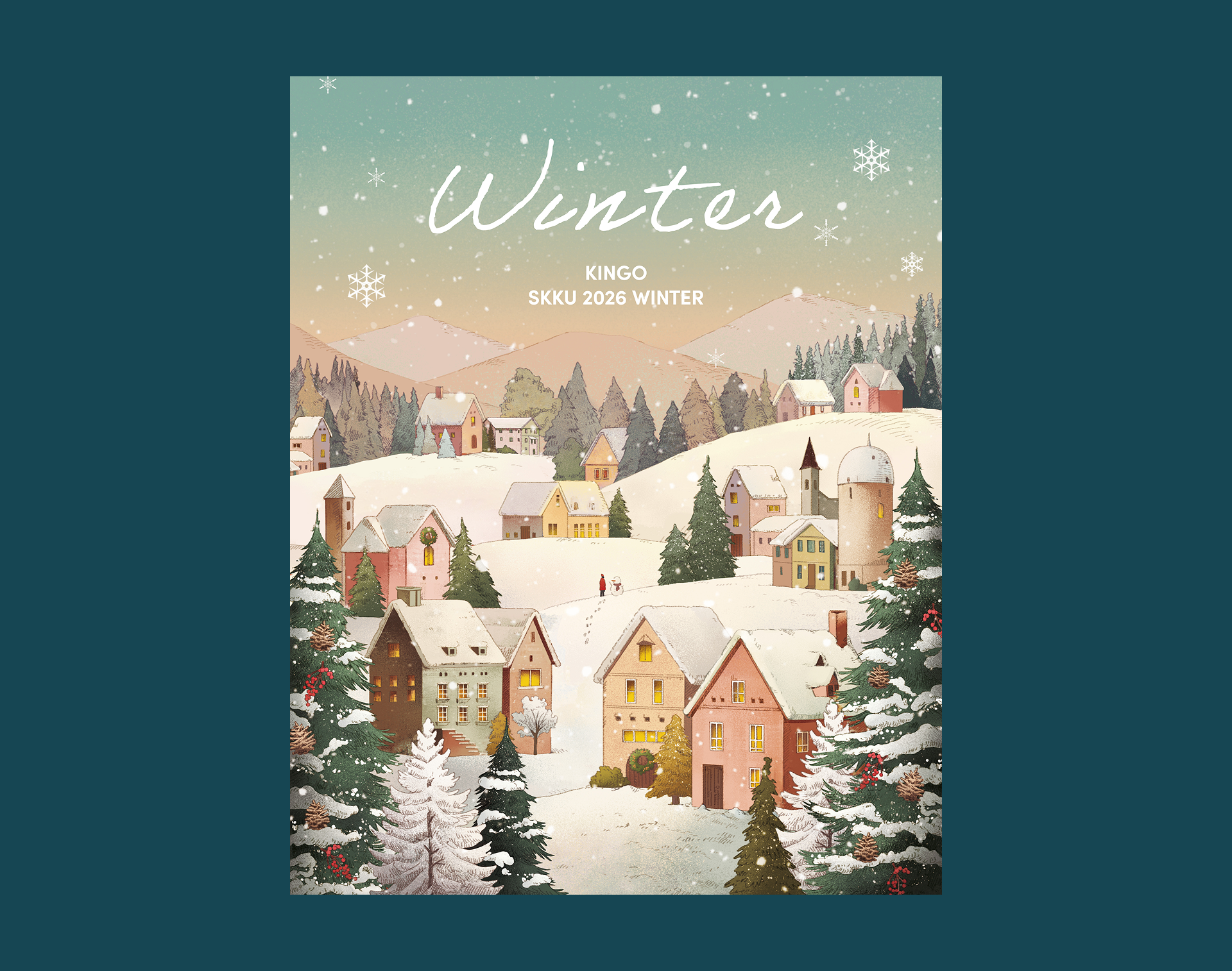
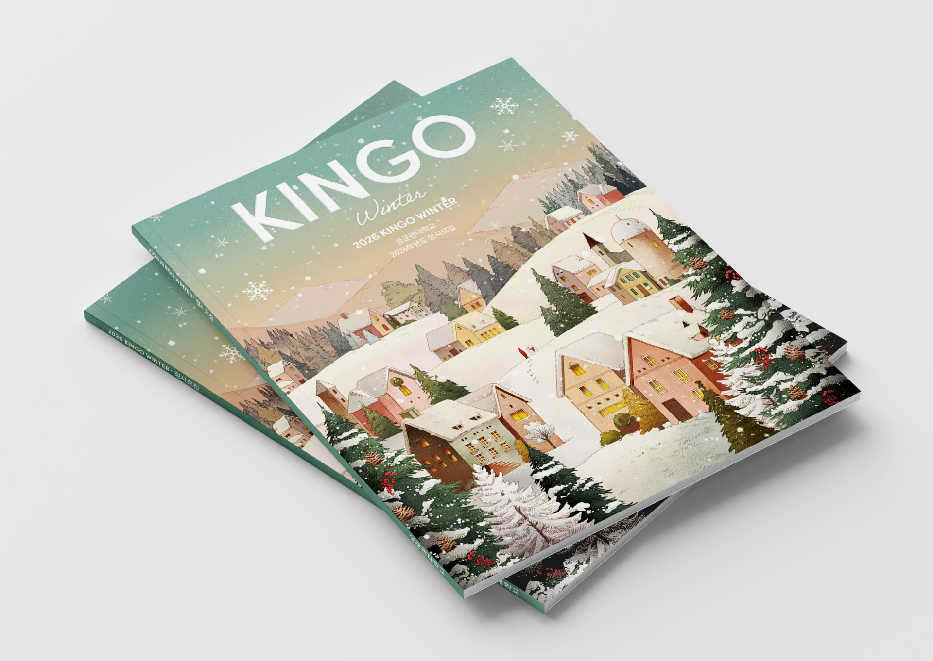
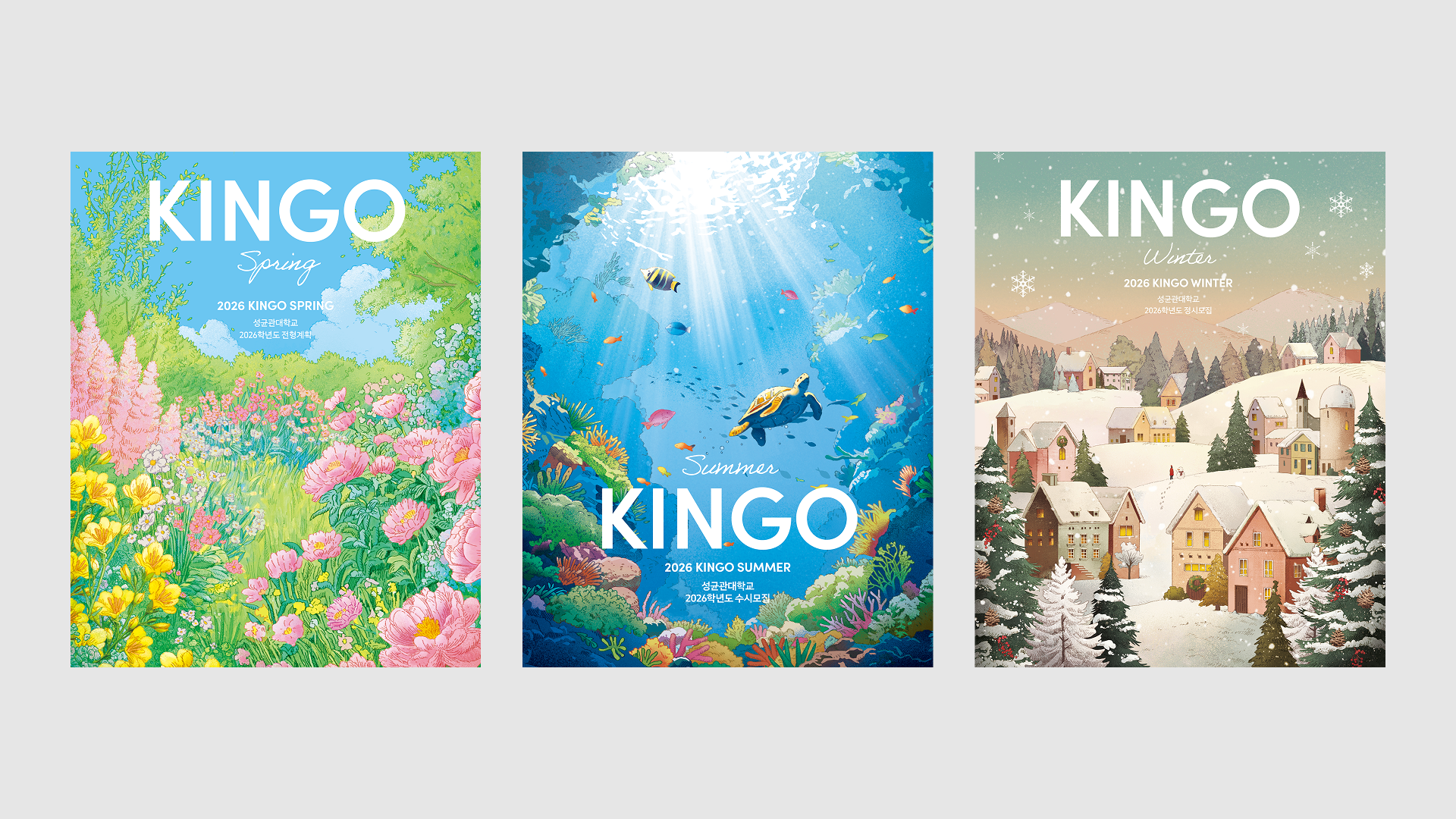
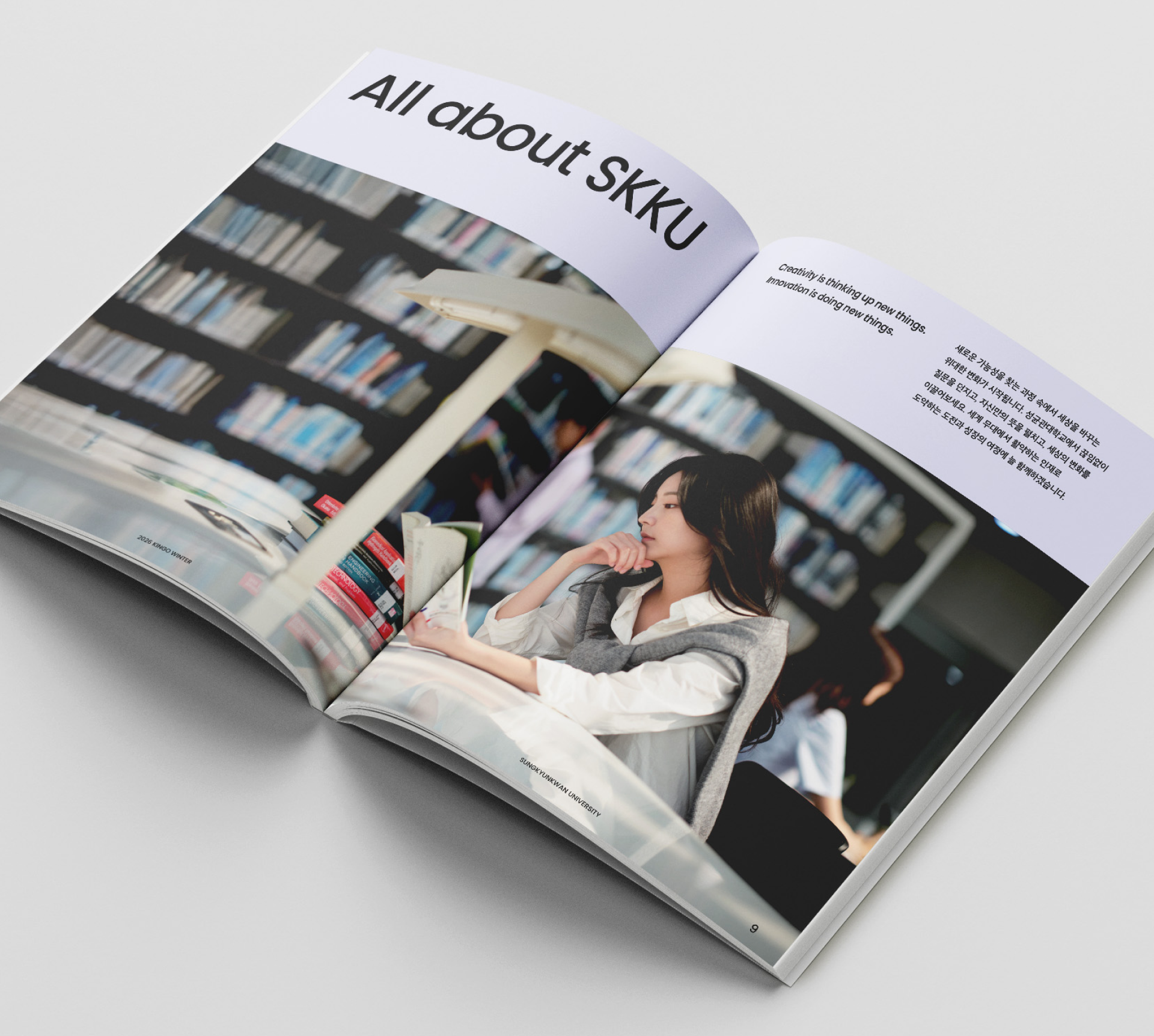
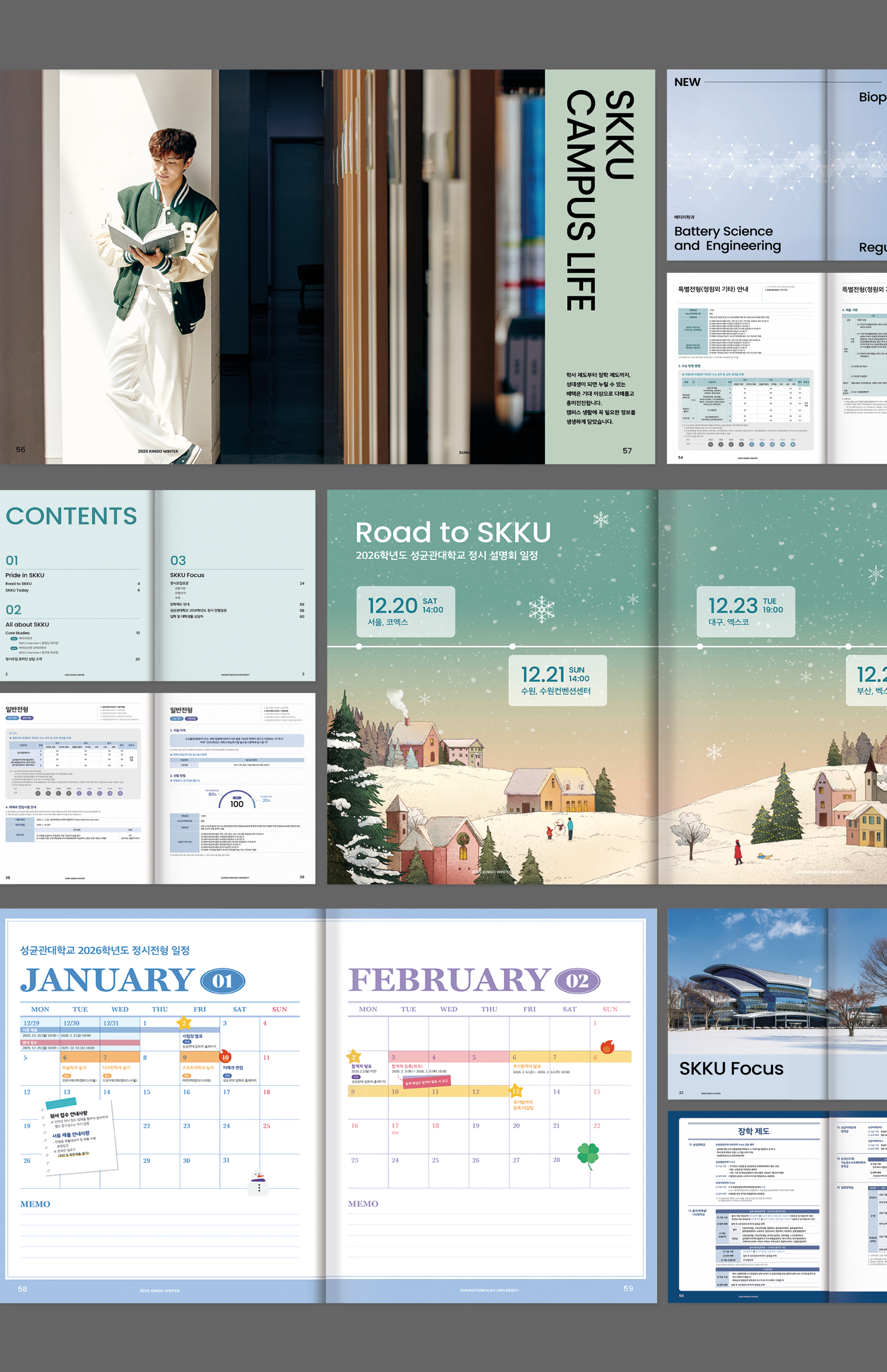
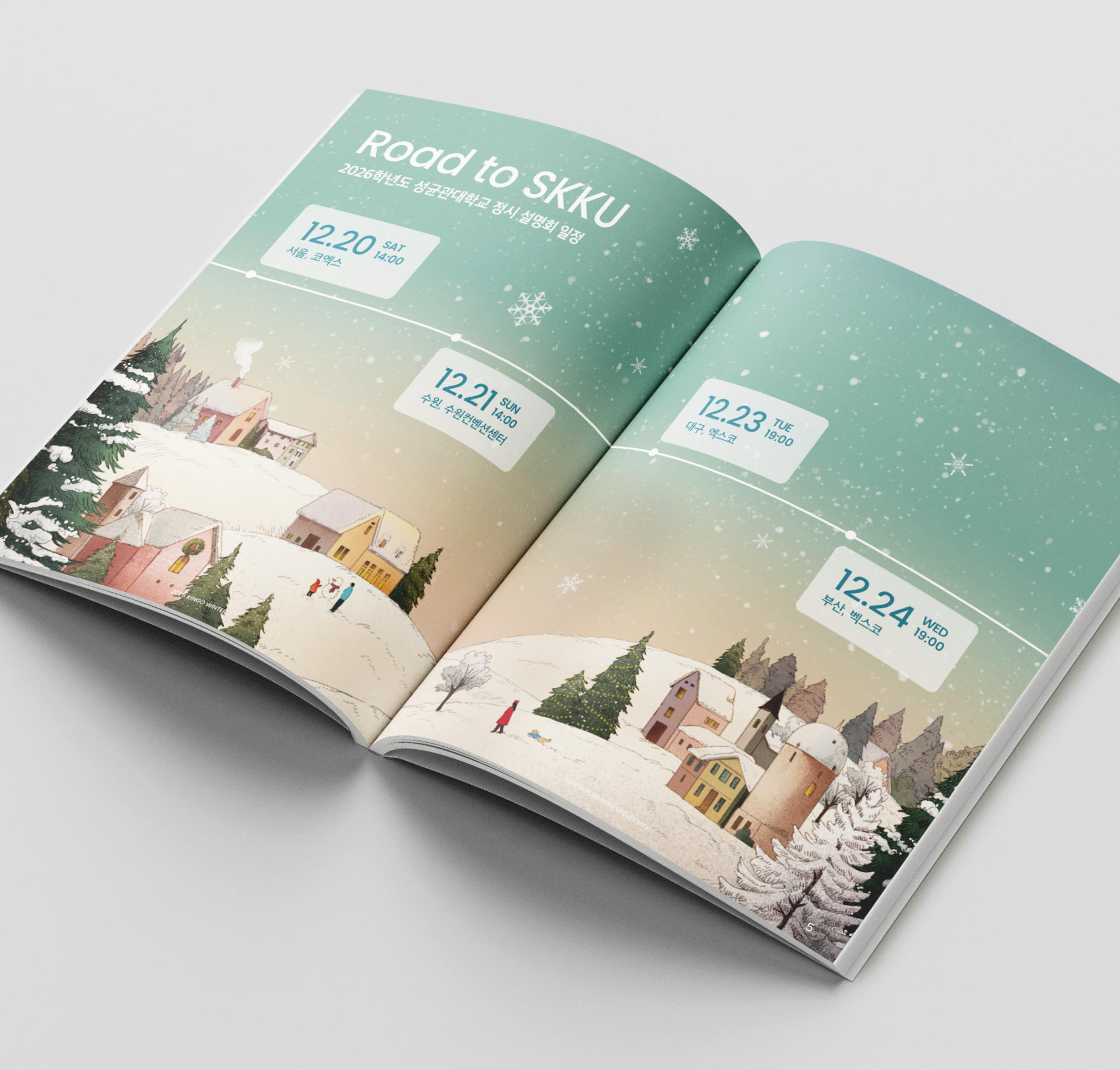
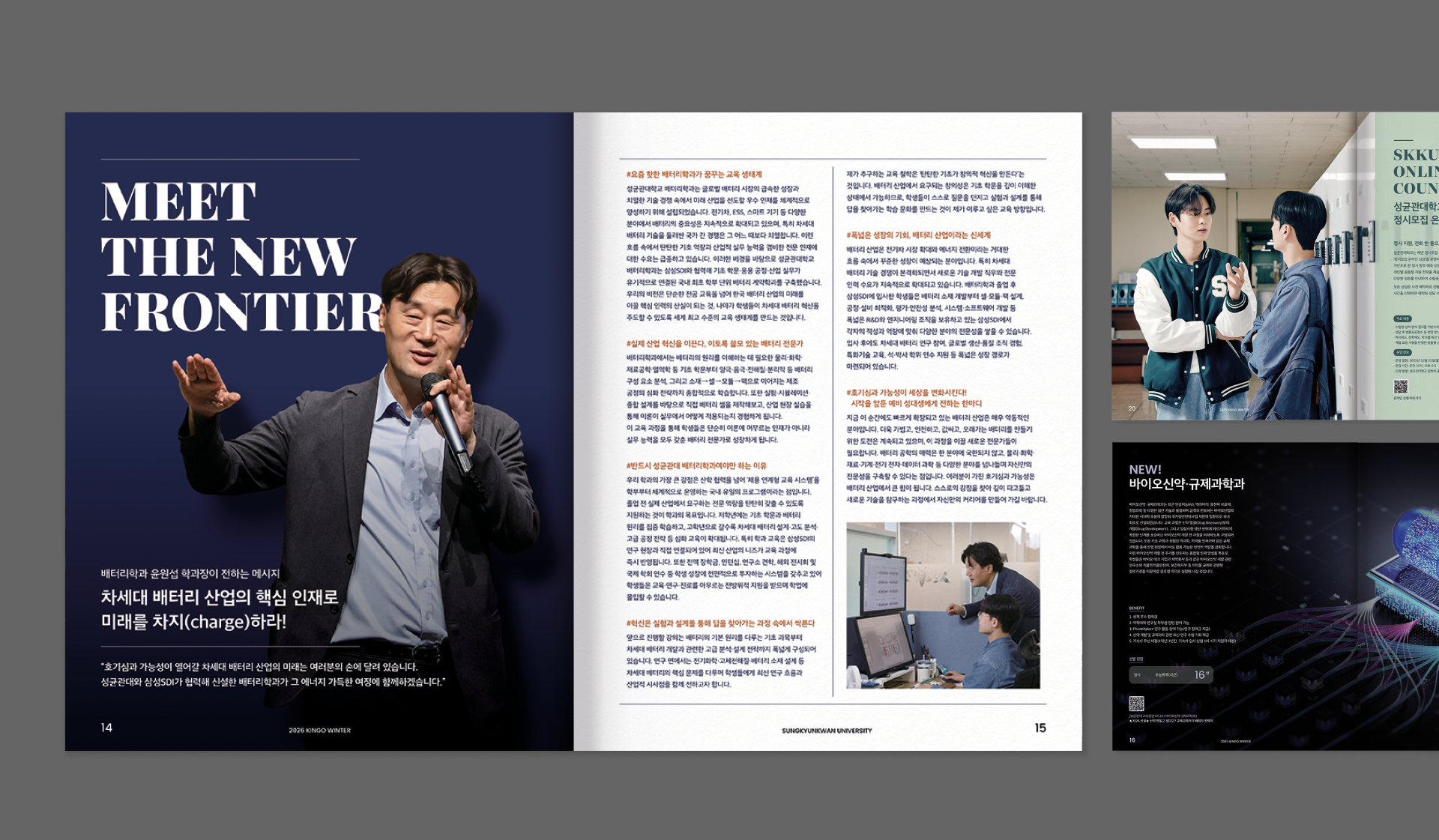
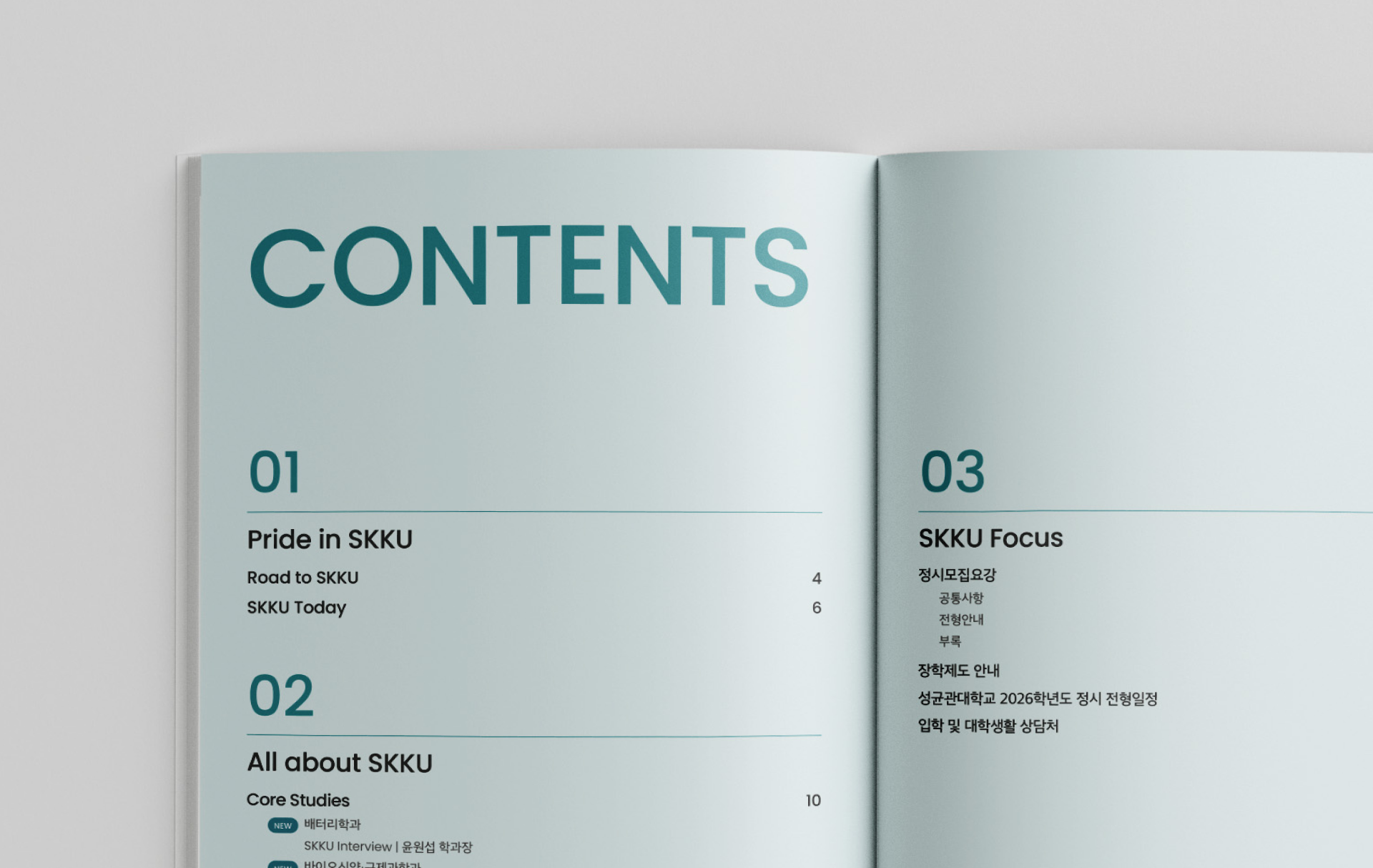
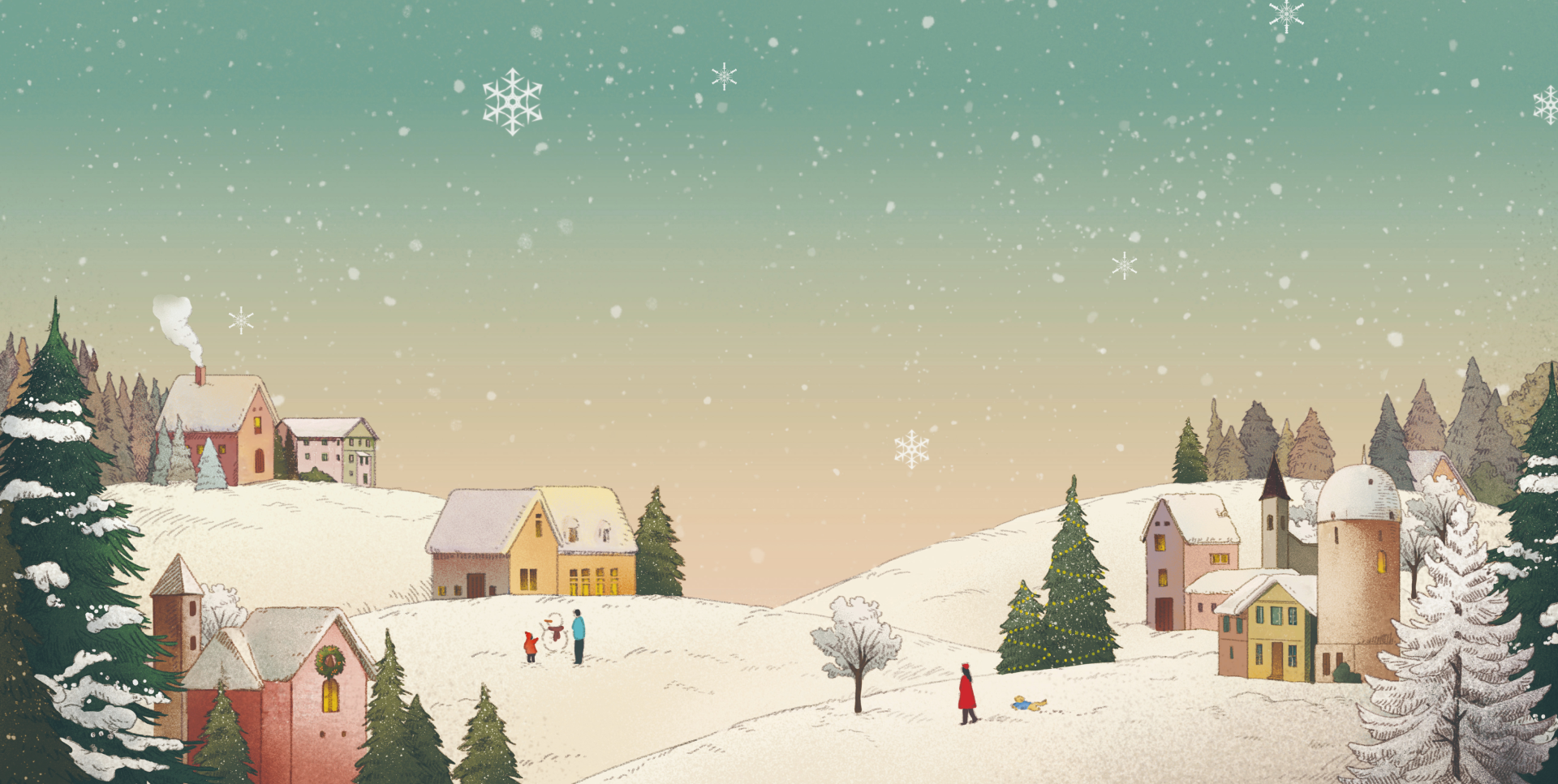
2026학년도 성균관대학교 신입생을 위한 Kingo Winter 모집요강 디자인을 진행하였습니다. 겨울호는 계절의 특성을 반영해 차분하고 깊이 있는 톤앤무드로 접근하였으며, 단순한 정보 전달을 넘어 예비 신입생들이 대학이라는 새로운 환경을 천천히 탐색할 수 있도록, 정보의 명료함과 정서적 접근이 균형을 이루는 매거진형 콘텐츠로 기획하였습니다. 표지는 눈이 쌓인 마을을 일러스트레이션으로 표현하여 연하장을 연상시키는 따뜻하고 고요한 분위기를 담아냈습니다. 새로운 시작을 앞둔 시점의 기대와 긴장이 공존하는 순간을 시각적으로 표현하며, 입학을 앞둔 ‘겨울’이라는 시간의 정서를 동화적이고 은유적인 이미지로 풀어냈습니다. 내지는 복잡한 정보를 단계적으로 이해할 수 있도록 구조화하여, 안정적인 정보 경험을 제공하는 데 중점을 두었습니다. 주요 페이지에서는 여백과 리듬감을 조절해, 겨울호 전반에 걸쳐 정제되고 절제된 톤을 유지했습니다. 컬러는 겨울을 연상시키는 저채도의 뉴트럴 톤을 중심으로 구성하고, 일부 지점에만 포인트 컬러를 더해 시각적 집중도를 높였습니다. 이를 통해 신뢰감을 기반으로 하면서도 차분하고 따뜻한 인상을 전달하였습니다.
We designed the Kingo Winter 2026 Admission Guide for new students at Sungkyunkwan University.
The Winter edition approaches the season with a calm and contemplative tone, moving beyond straightforward information delivery to offer a magazine-style experience. It was designed to help prospective students gently explore the unfamiliar environment of university life, balancing clarity of information with emotional resonance. The cover features an illustrated snow-covered village, evoking the warmth and quiet atmosphere of a year-end greeting card. It visually captures the moment where anticipation and tension coexist before a new beginning, translating the emotional state of “winter” before admission into a poetic and metaphorical image. The interior pages are carefully structured to guide readers through complex information step by step, prioritizing a stable and intuitive information experience. Throughout the key spreads, the use of white space and visual rhythm was carefully controlled to maintain a refined and restrained tone across the entire Winter edition. The color palette is centered around low-saturation neutral tones associated with winter, with accent colors applied selectively to enhance visual focus. Through this approach, the design conveys a sense of trust while maintaining a calm, warm, and composed impression.
The Winter edition approaches the season with a calm and contemplative tone, moving beyond straightforward information delivery to offer a magazine-style experience. It was designed to help prospective students gently explore the unfamiliar environment of university life, balancing clarity of information with emotional resonance. The cover features an illustrated snow-covered village, evoking the warmth and quiet atmosphere of a year-end greeting card. It visually captures the moment where anticipation and tension coexist before a new beginning, translating the emotional state of “winter” before admission into a poetic and metaphorical image. The interior pages are carefully structured to guide readers through complex information step by step, prioritizing a stable and intuitive information experience. Throughout the key spreads, the use of white space and visual rhythm was carefully controlled to maintain a refined and restrained tone across the entire Winter edition. The color palette is centered around low-saturation neutral tones associated with winter, with accent colors applied selectively to enhance visual focus. Through this approach, the design conveys a sense of trust while maintaining a calm, warm, and composed impression.
CLIENT
Sungkyunkwan University
DATE
2025.12