
Project Overview
롯데렌터카의 기존 광고 모델의 공백을 자연스럽게 메우기 위해, 일러스트레이션 스타일을 활용한 키 비주얼을 새롭게 제작하였습니다.
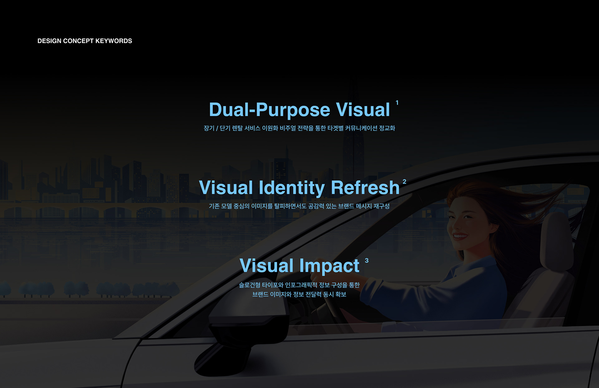
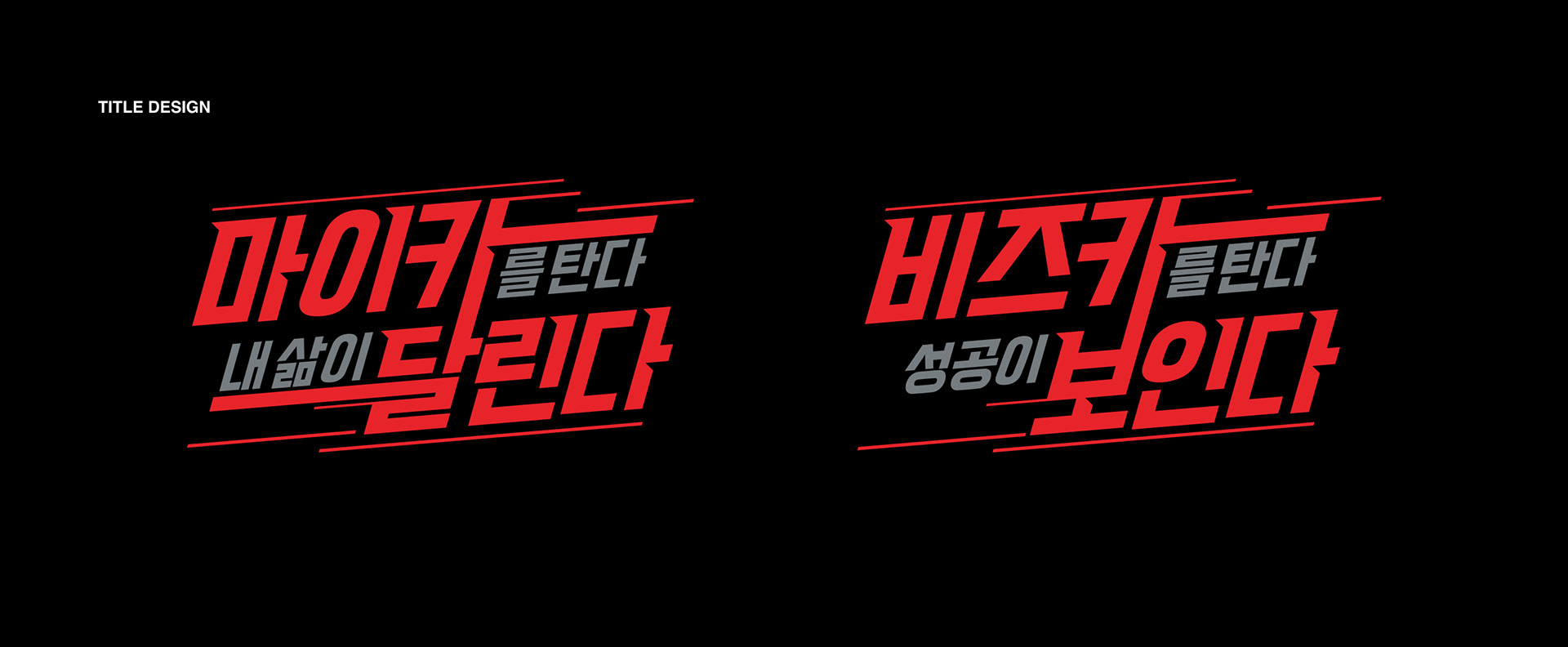
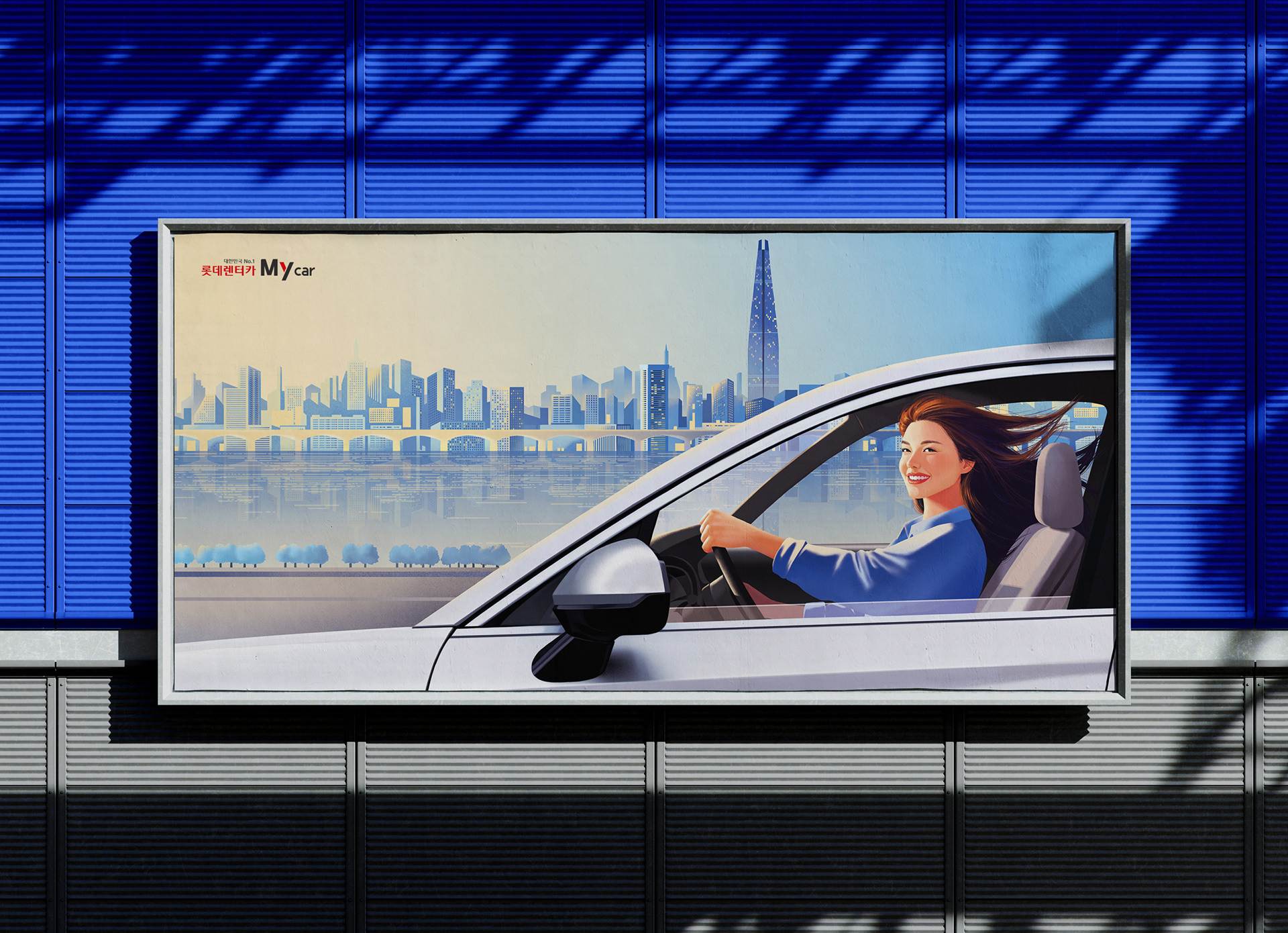
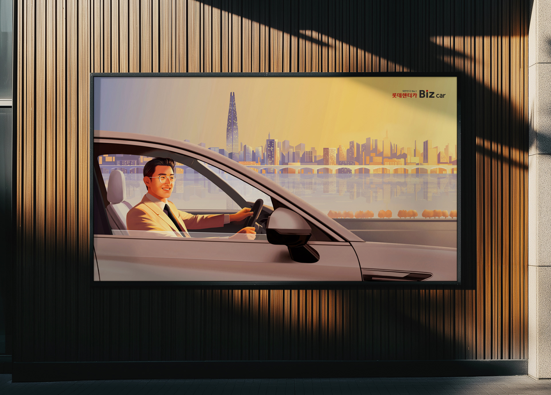
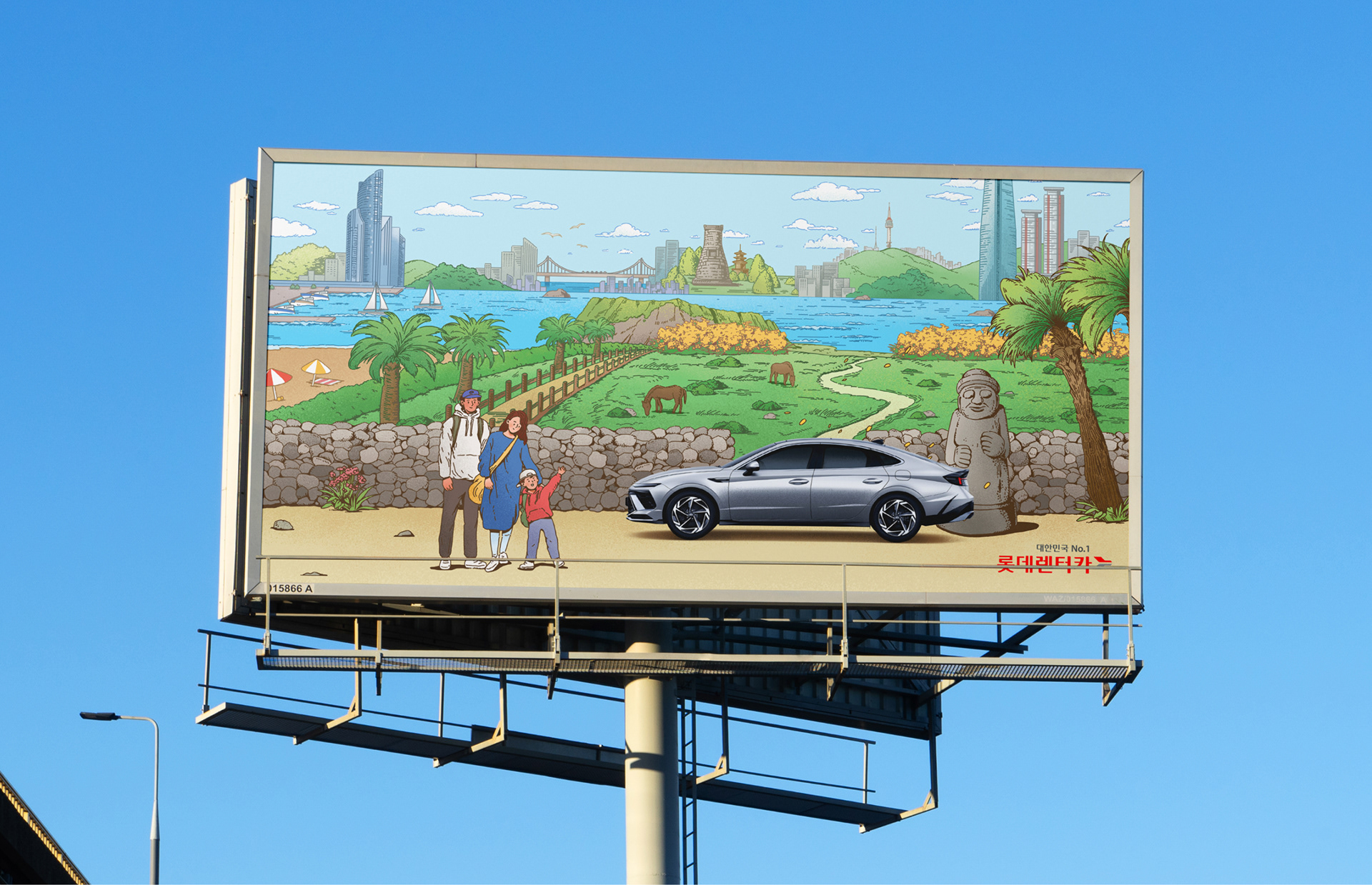
장기 및 단기 렌터카 서비스로 분리된 구조에 맞춰 각 타깃층에 최적화된 메시지를 설계하고, 이를 통해 브랜드의 폭넓은 고객 기반과 서비스 전문성을 시각적으로 표현했습니다. 장기 렌탈 서비스는 서울의 도시 풍경과 자연스러운 드라이빙 장면을 배경으로 구성하여, 신뢰감 있고 긍정적인 브랜드 이미지를 전달하며, 컬러 팔레트 또한 타깃별 성격에 맞춰 차별화했습니다. 단기 렌탈 서비스는 서울을 포함한 전국 주요 랜드마크를 배경으로, 가족 중심의 따뜻하고 친근한 분위기를 담았습니다. 여기에 슬로건형 타이포그래피와 인포그래픽 스타일의 서비스 안내 구성을 더해, 정보 전달력과 브랜드 캠페인의 임팩트를 동시에 확보하였습니다.
To seamlessly fill the gap left by the previous brand model, Lotte Rent-a-Car introduced a new key visual using an illustration-based style.
By segmenting services into long-term and short-term rentals, we crafted optimized messages for each target audience, visually highlighting the brand’s broad customer base and service expertise.For the long-term rental service, the visuals feature natural driving scenes set against the backdrop of Seoul’s cityscape, delivering a sense of trust and positivity. The color palette was also tailored to match the tone of each customer group. The short-term rental service focuses on accessibility and everyday usability, incorporating friendly and warm color tones alongside illustrations of families and iconic landmarks across Korea, including Seoul. Bold slogan-style typography and infographic-inspired layouts further enhance the clarity of service information and amplify the impact of the brand campaign.