
Lotte Department Tour Guide Leaflet
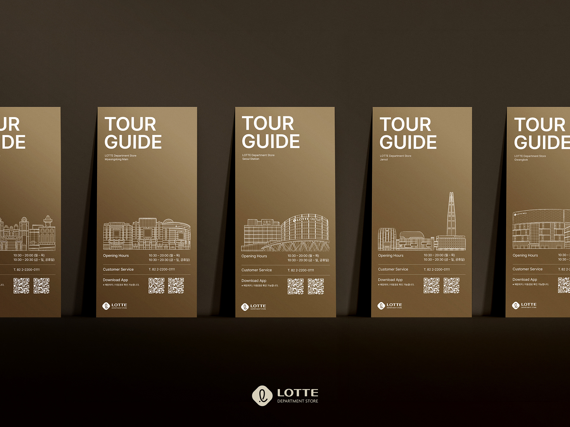
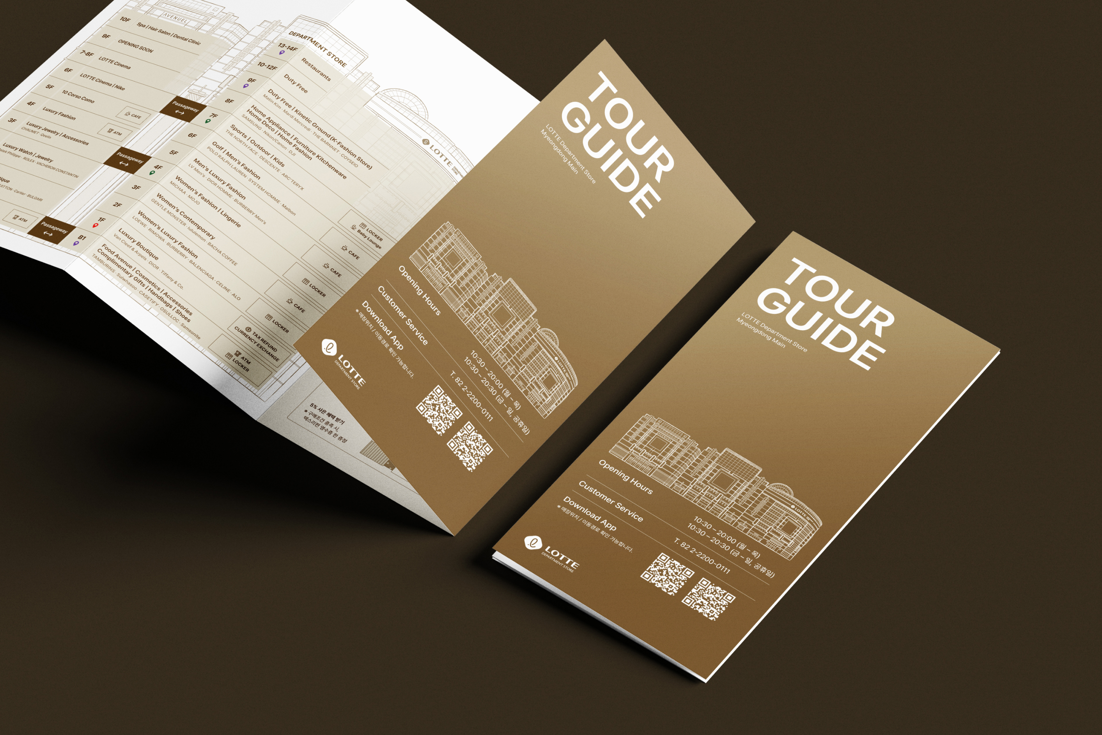
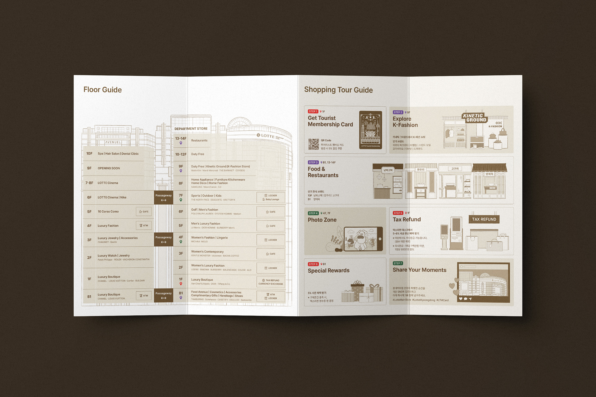
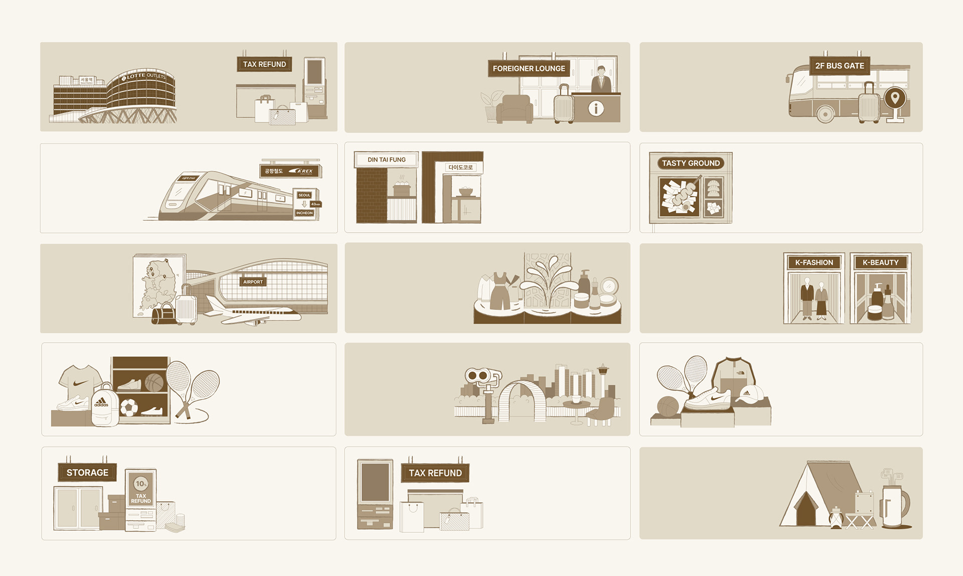
롯데백화점 5개 지점을 대상으로 한 외국인 고객용 투어 가이드 리플렛 디자인 프로젝트입니다. 기존 플로어 가이드 중심의 매장 안내를 넘어, 브랜드·F&B·주변 관광 정보를 아우르는 콘텐츠로 확장하며 백화점을 방문하는 외국인 여행객에게 필요한 정보를 하나의 리플렛 안에 담아내는 데 집중했습니다.
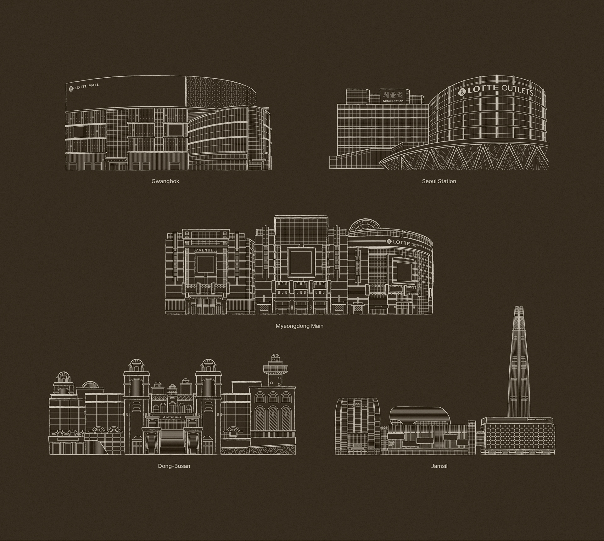
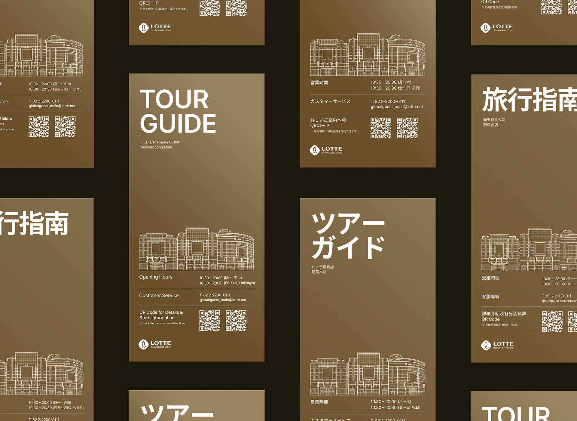
골드에서 브라운으로 이어지는 컬러 팔레트는 롯데백화점 고유의 프리미엄한 브랜드 톤을 그대로 이어가면서도, 각 지점 건물의 외관을 라인 일러스트로 정교하게 구현해 무게감 있는 배경 위에 담백하고 세련된 인상을 더했습니다. 점포마다 다른 건물의 형태를 세밀하게 드로잉해 다섯 개 지점이 하나의 시리즈처럼 통일감을 갖되, 각자의 건축적 정체성은 잃지 않도록 설계했습니다. 해당 디자인은 영어·일본어·중국어 등 다국어 버전으로 제작되어 글로벌 고객에게 신뢰도 높은 맞춤형 정보를 제공합니다.
골드에서 브라운으로 이어지는 컬러 팔레트는 롯데백화점 고유의 프리미엄한 브랜드 톤을 그대로 이어가면서도, 각 지점 건물의 외관을 라인 일러스트로 정교하게 구현해 무게감 있는 배경 위에 담백하고 세련된 인상을 더했습니다. 점포마다 다른 건물의 형태를 세밀하게 드로잉해 다섯 개 지점이 하나의 시리즈처럼 통일감을 갖되, 각자의 건축적 정체성은 잃지 않도록 설계했습니다. 해당 디자인은 영어·일본어·중국어 등 다국어 버전으로 제작되어 글로벌 고객에게 신뢰도 높은 맞춤형 정보를 제공합니다.
This is a tour guide leaflet design project for international customers across five Lotte Department Store branches. Moving beyond the previous floor-guide-centered store directory, the project expanded the content to cover brand introductions, F&B recommendations, and nearby tourist information — bringing together everything a foreign visitor needs into a single leaflet.
The gold-to-brown color palette carries forward Lotte Department Store's signature premium brand tone, while each branch's building exterior is rendered in detailed line illustration, adding a clean, refined touch to the weighty backdrop. Each store's distinct architecture was carefully drawn so that the five branches read as a cohesive series while still retaining their individual architectural identity. The design was produced in English, Japanese, and Chinese versions, delivering trustworthy, tailored information to a global customer base.
CLIENT
Lotte Department
DATE
2026.08
Lotte Department
DATE
2026.08