Kiaf SEOUL 2025
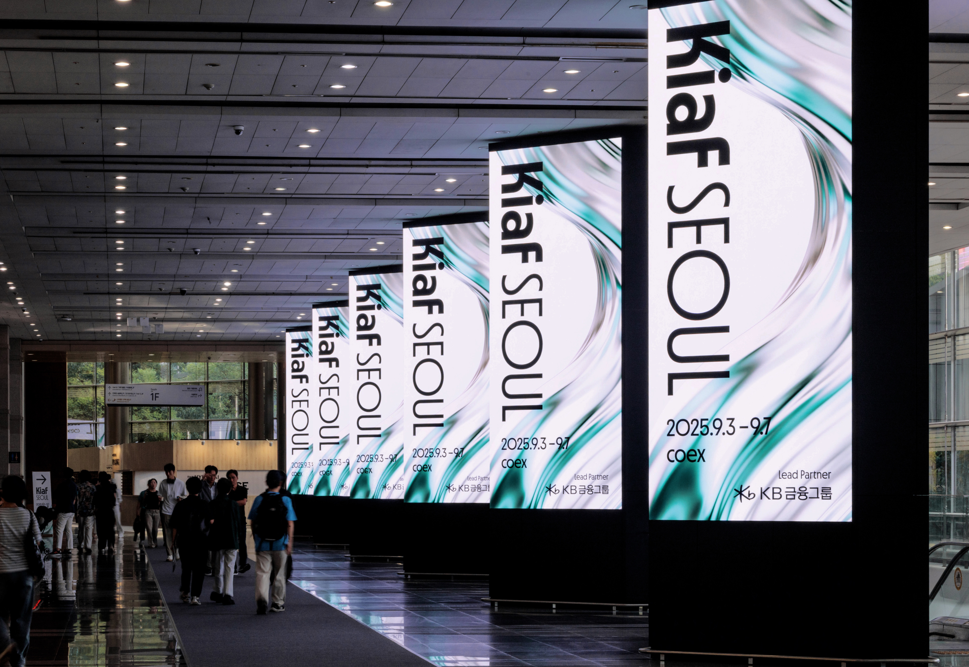
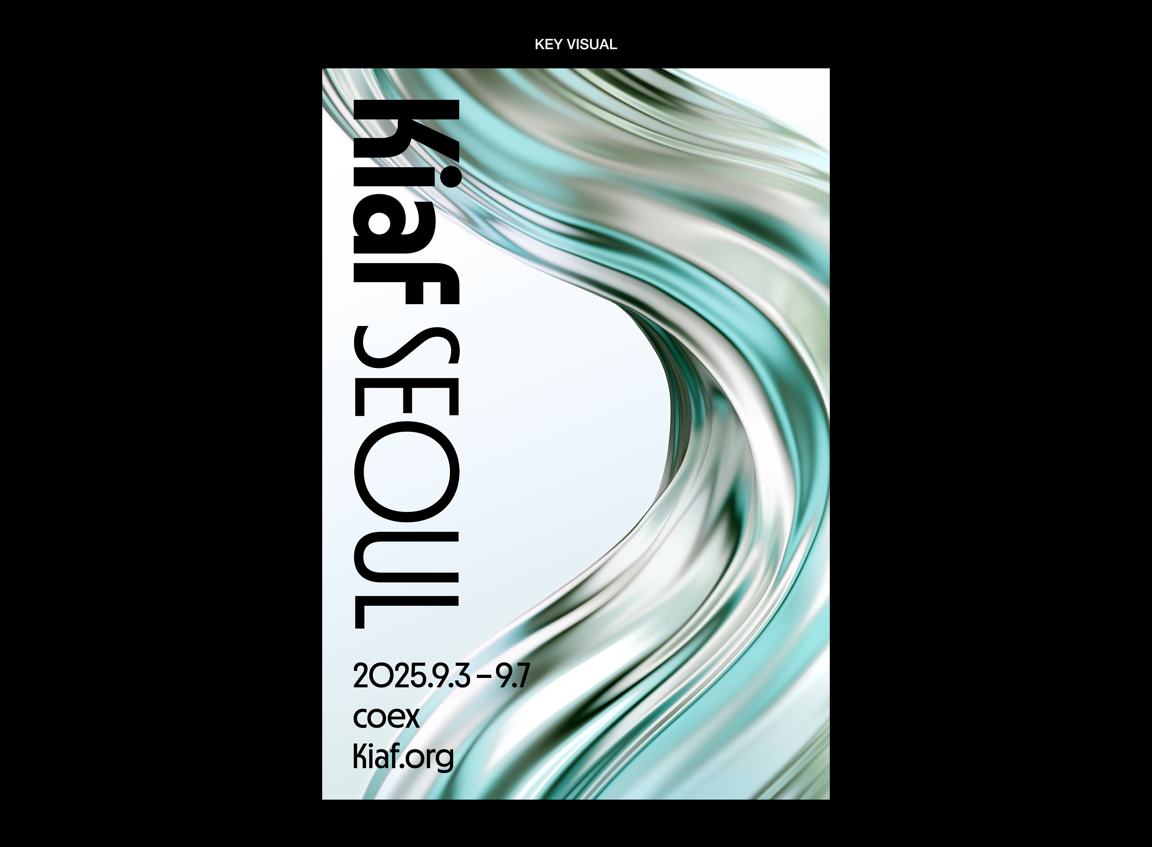
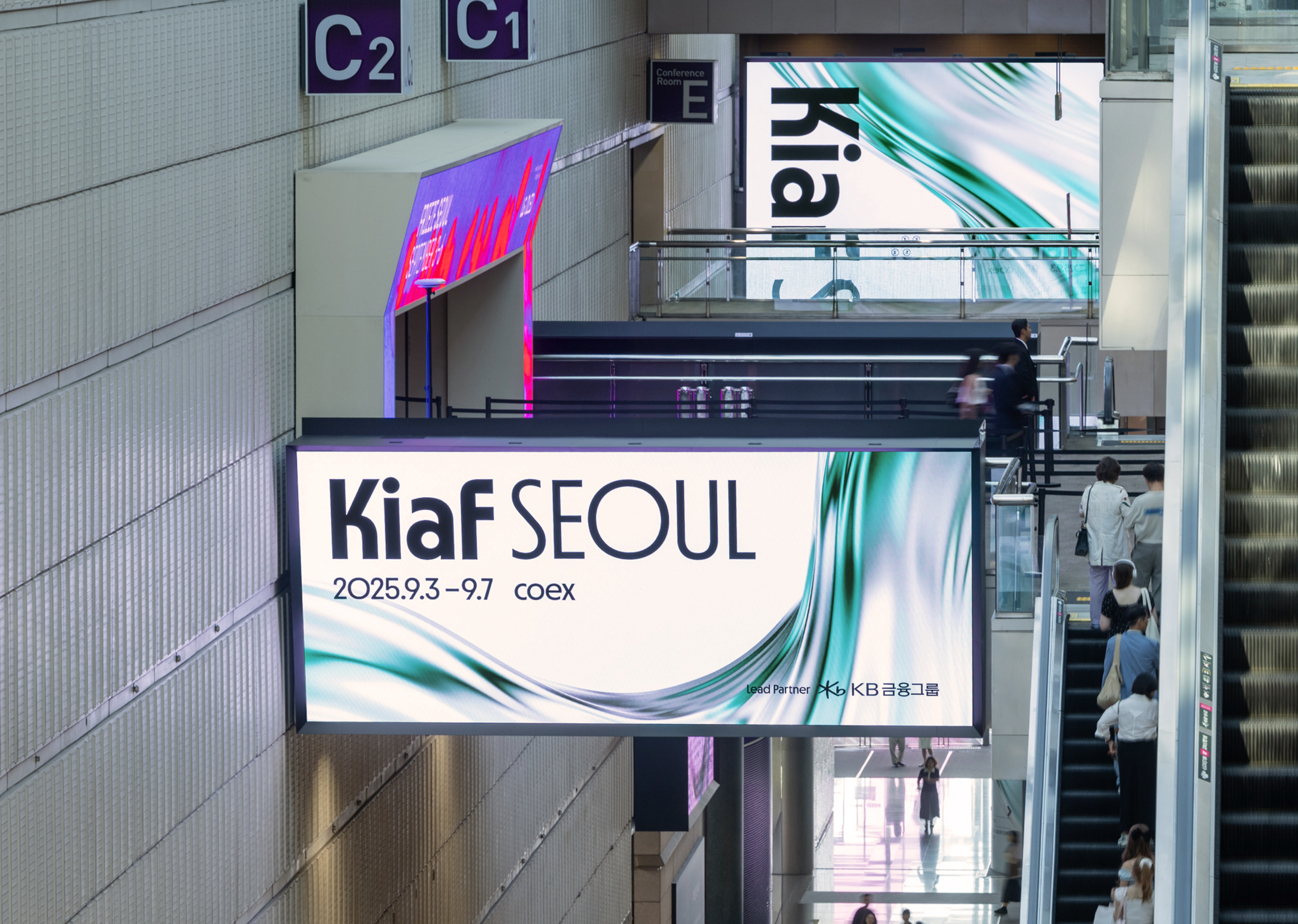
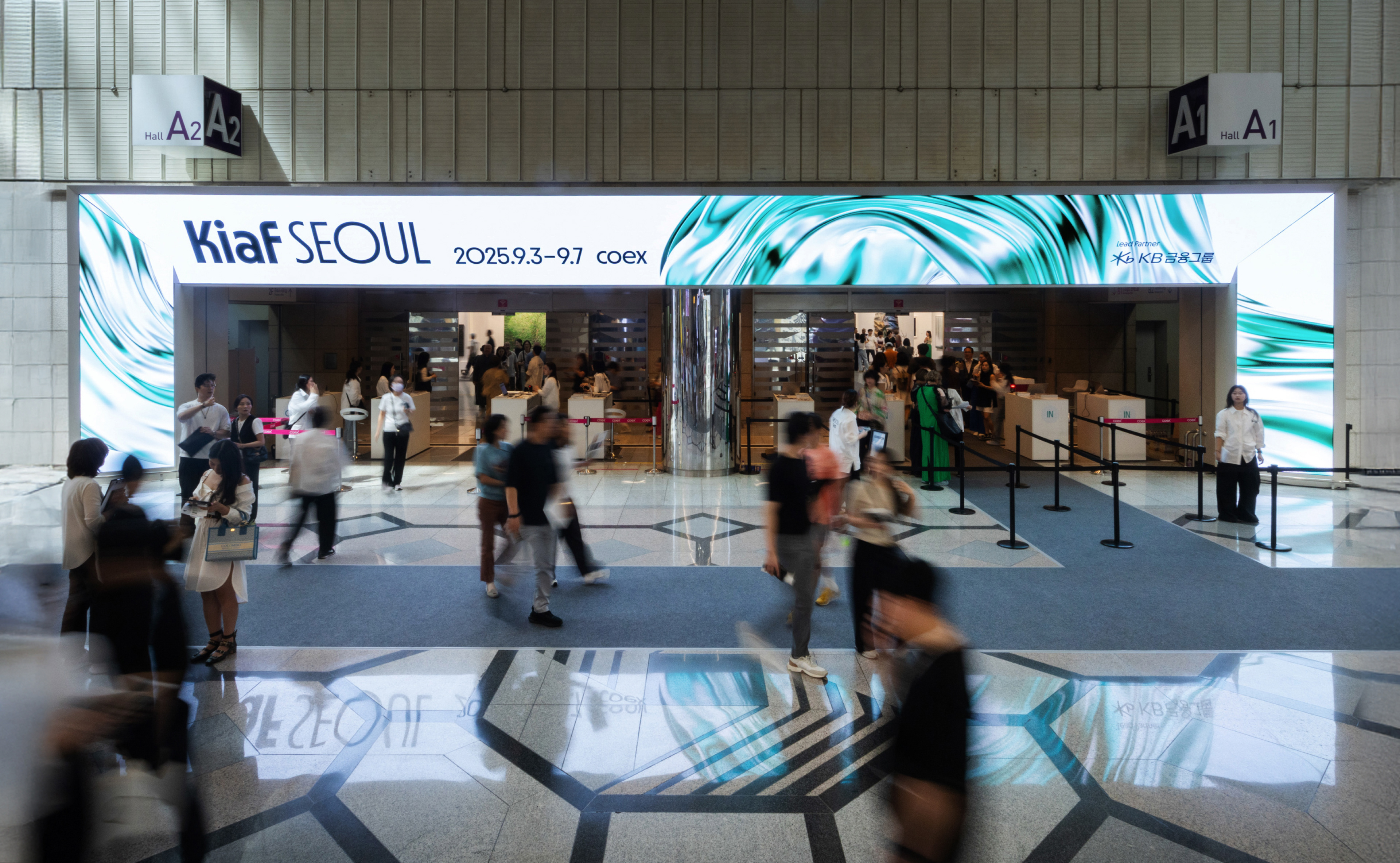
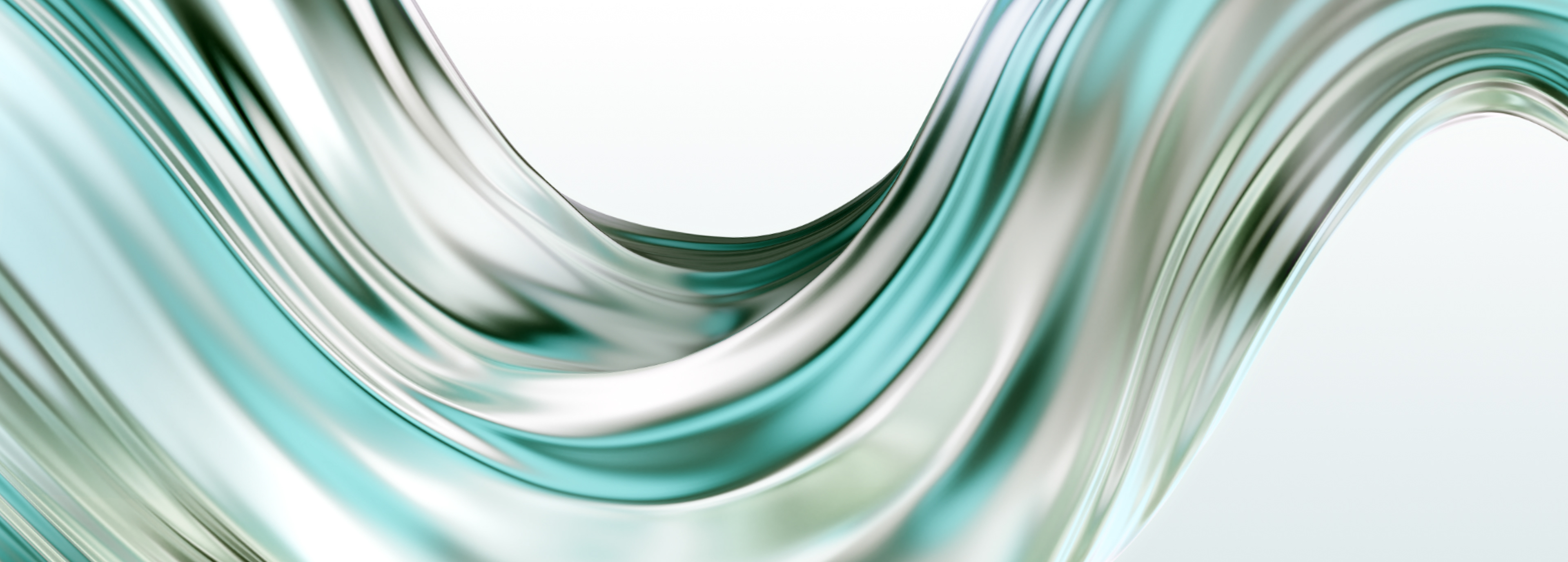
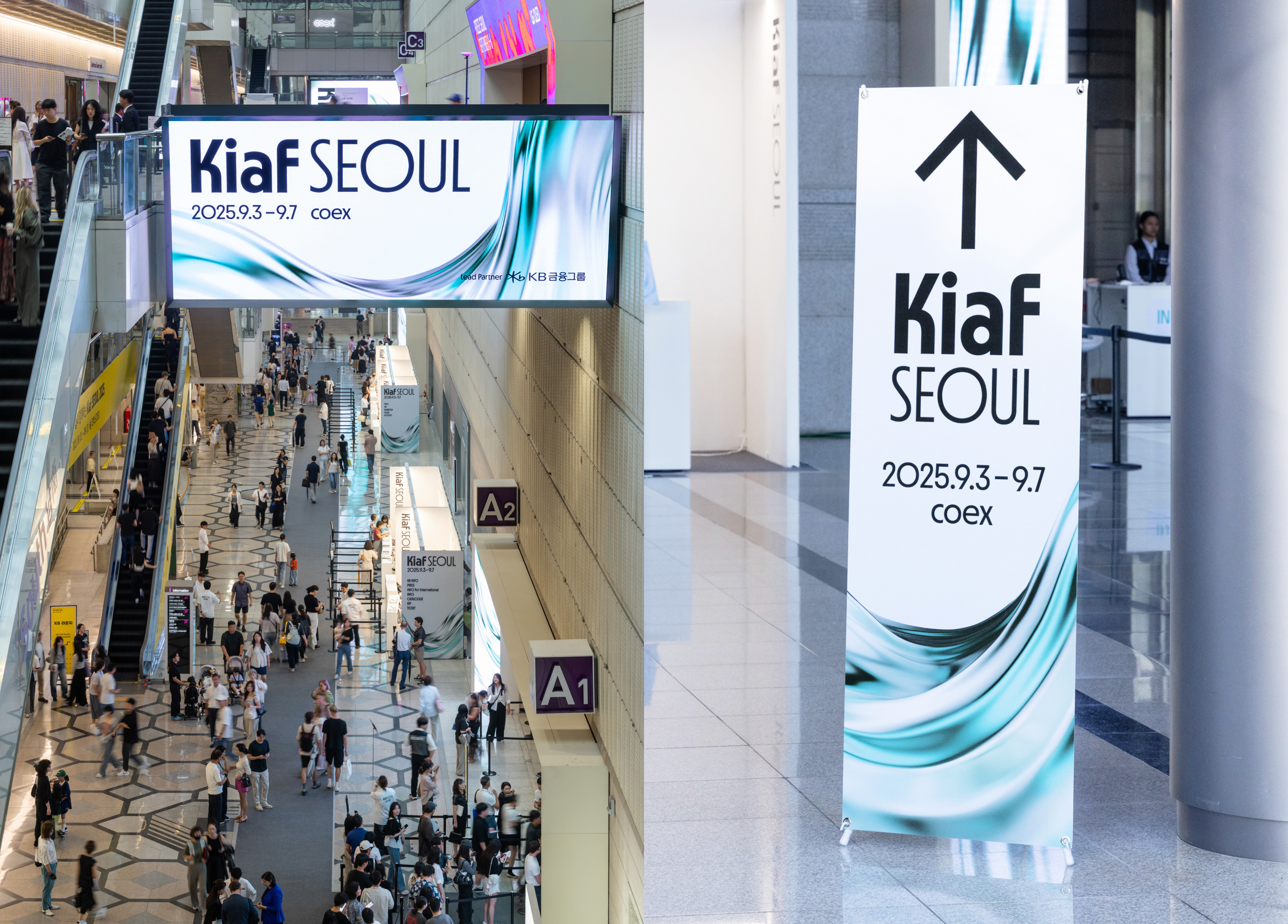
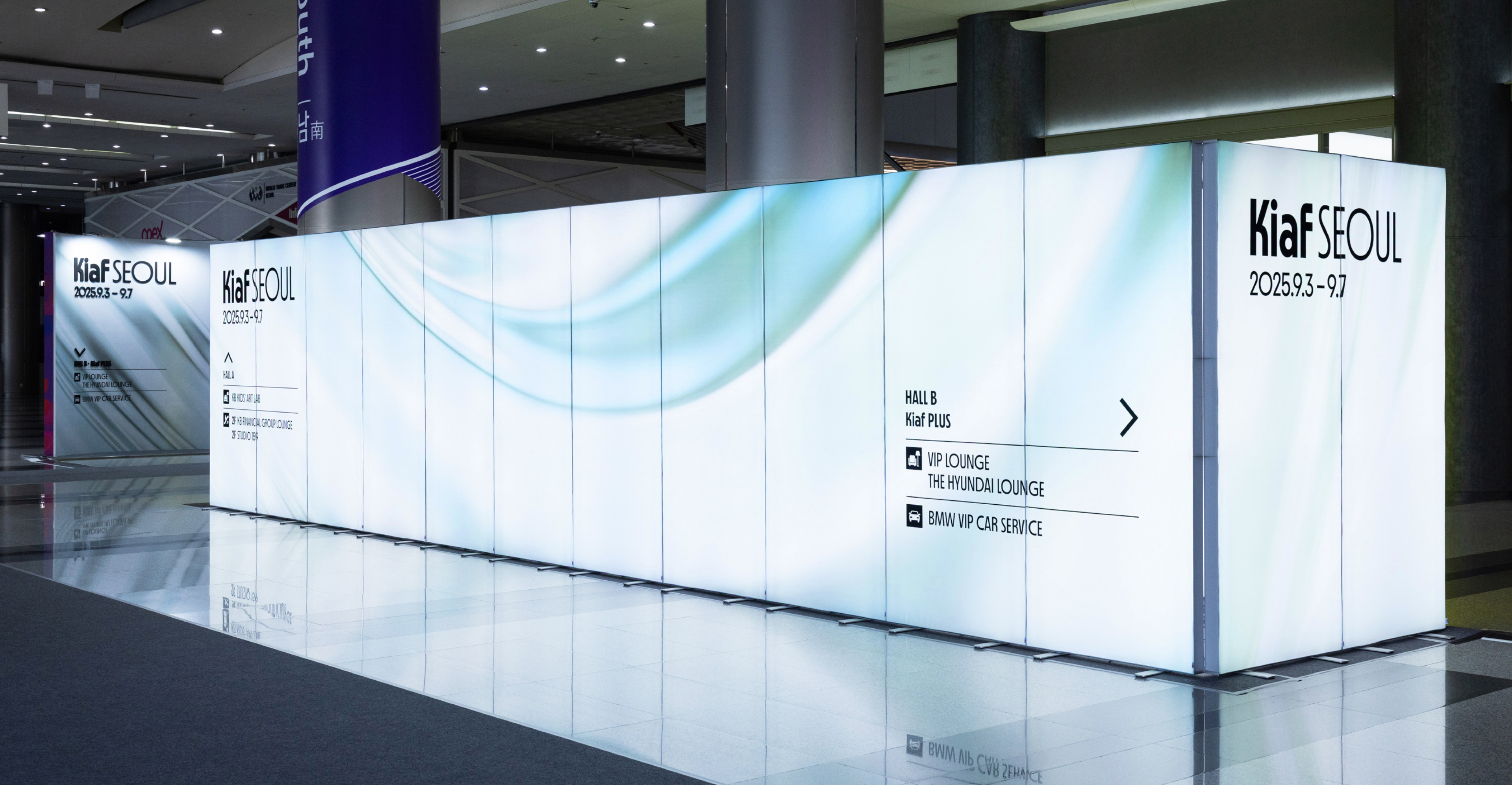
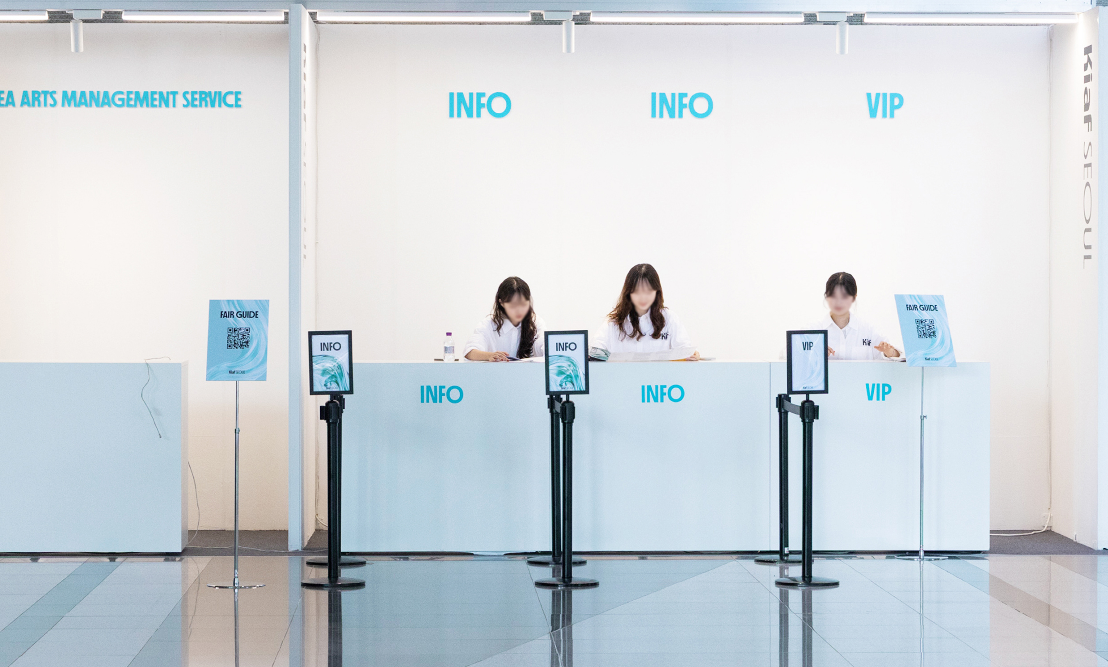
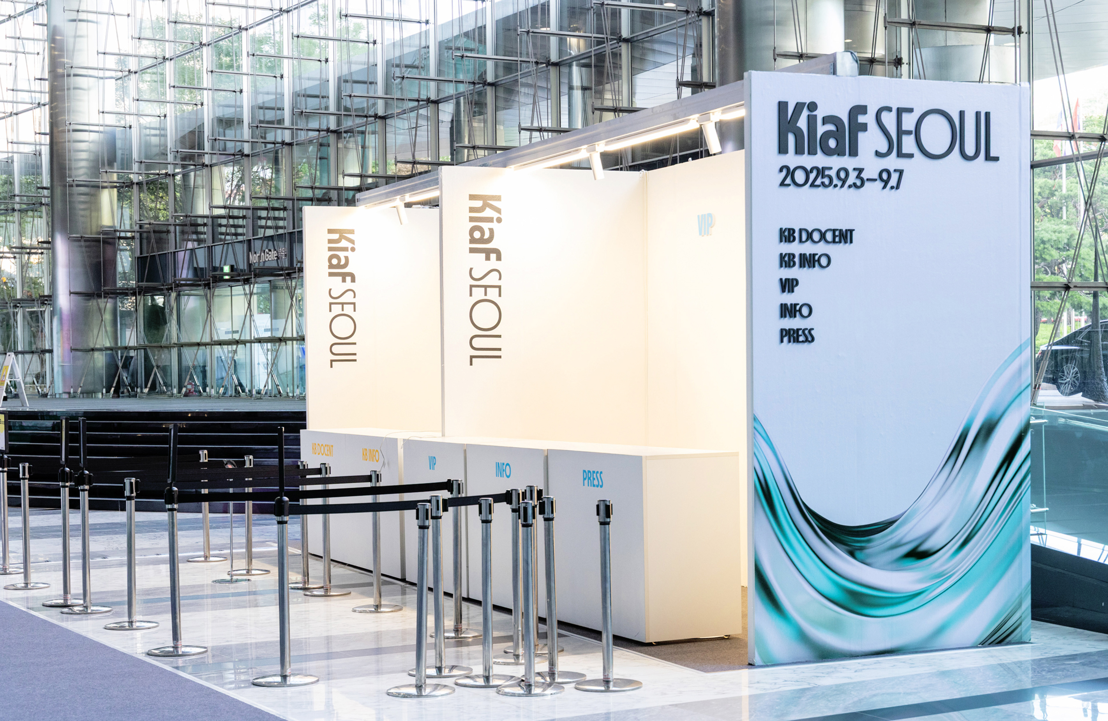
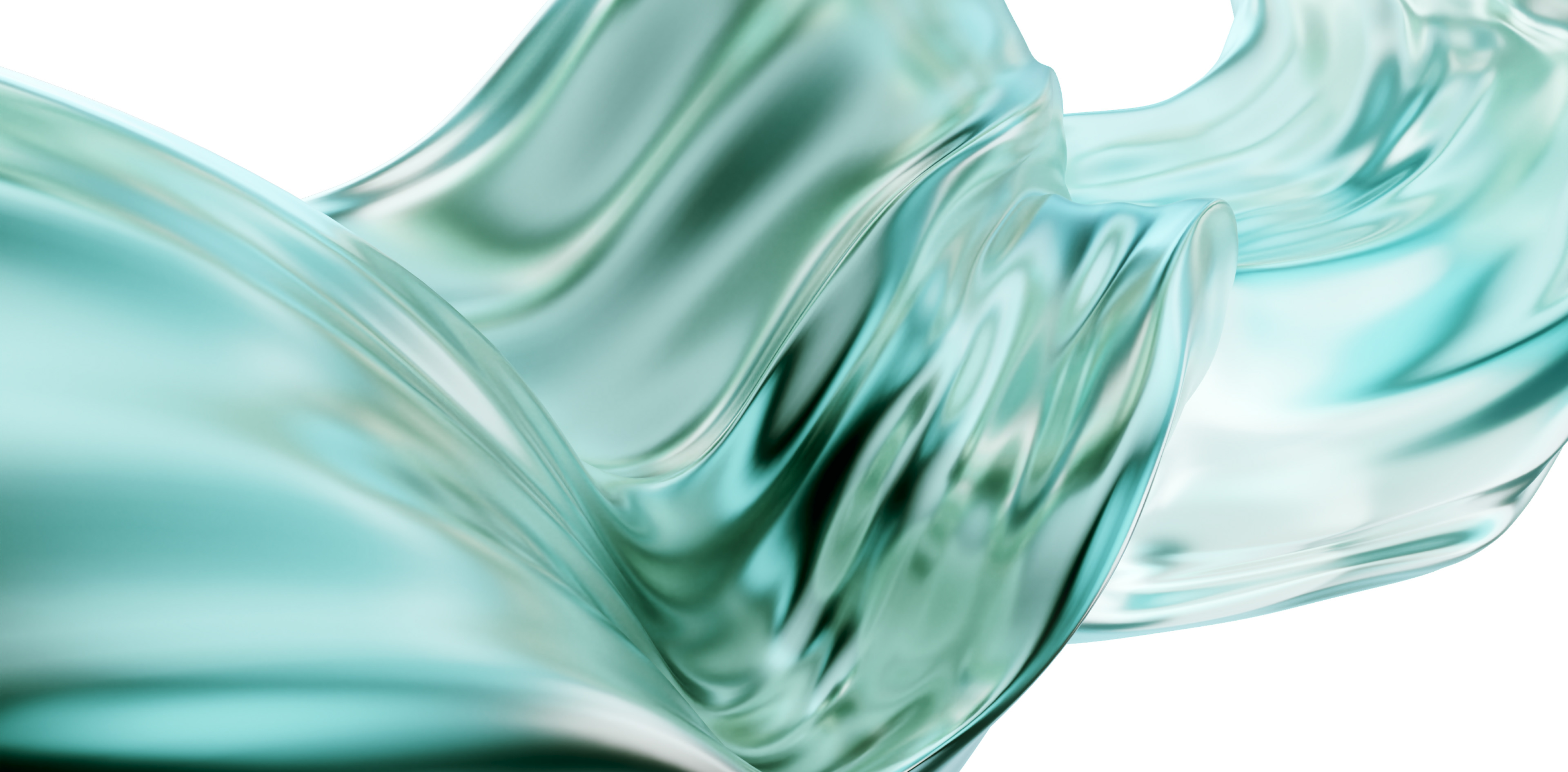
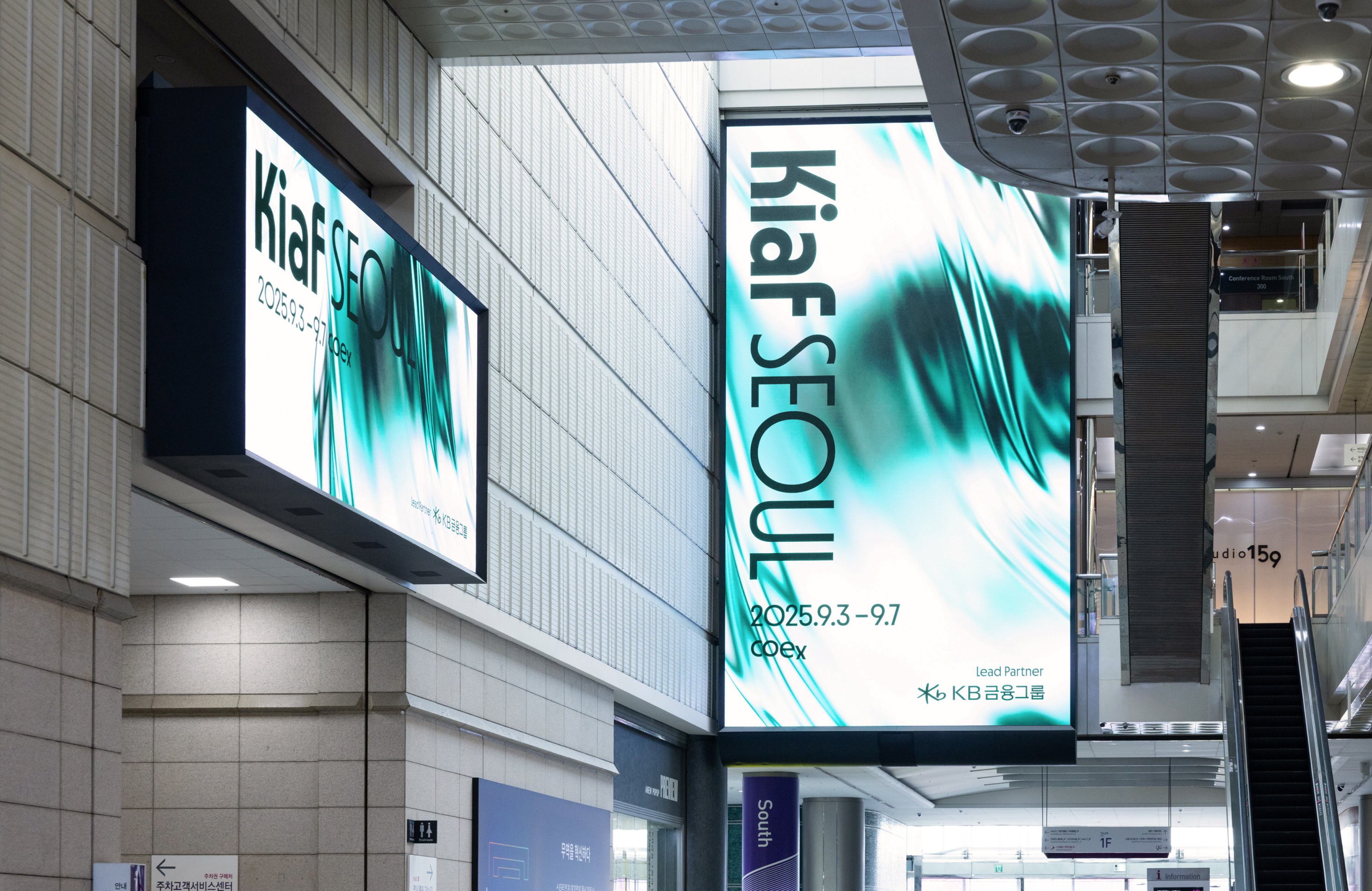
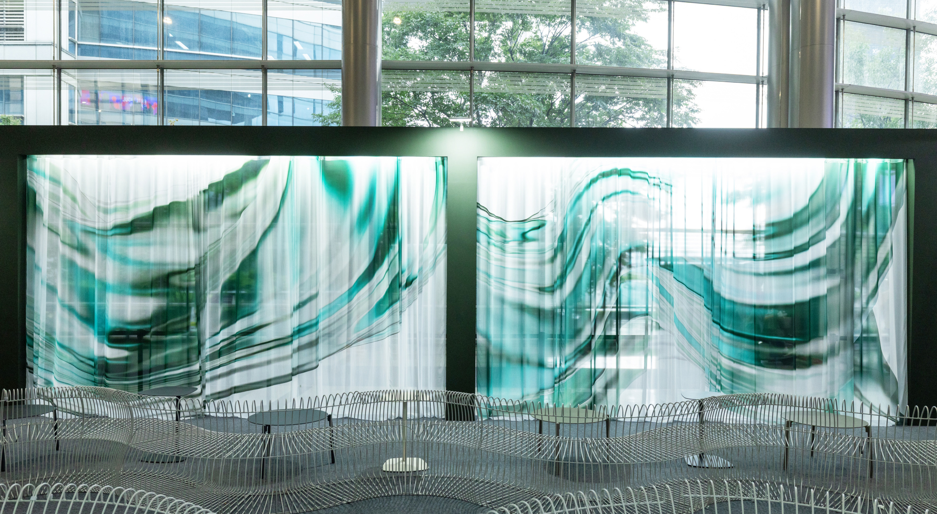
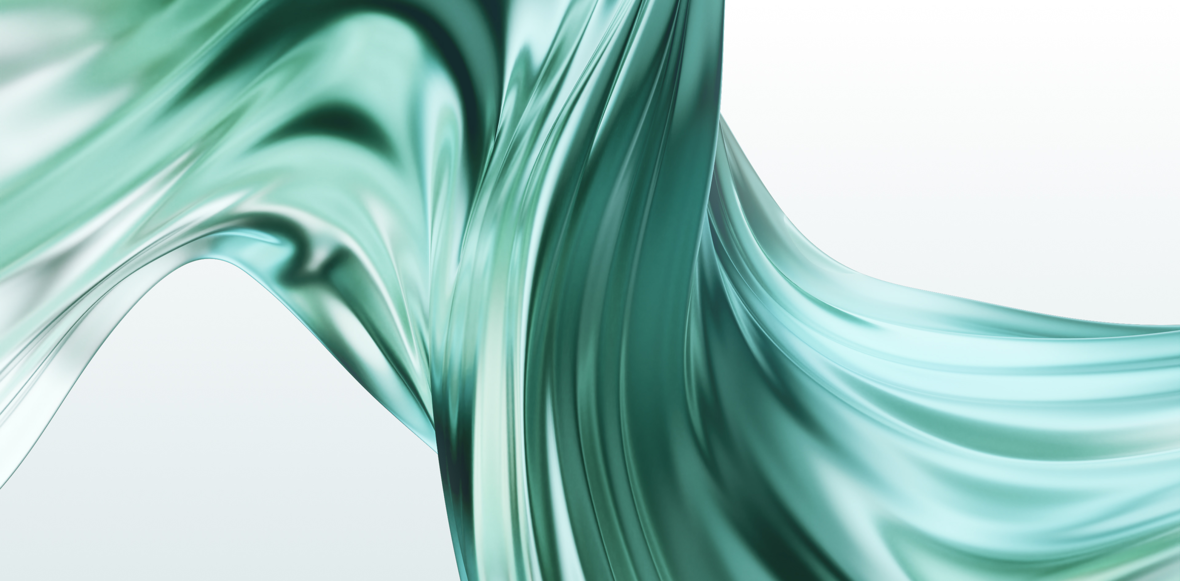
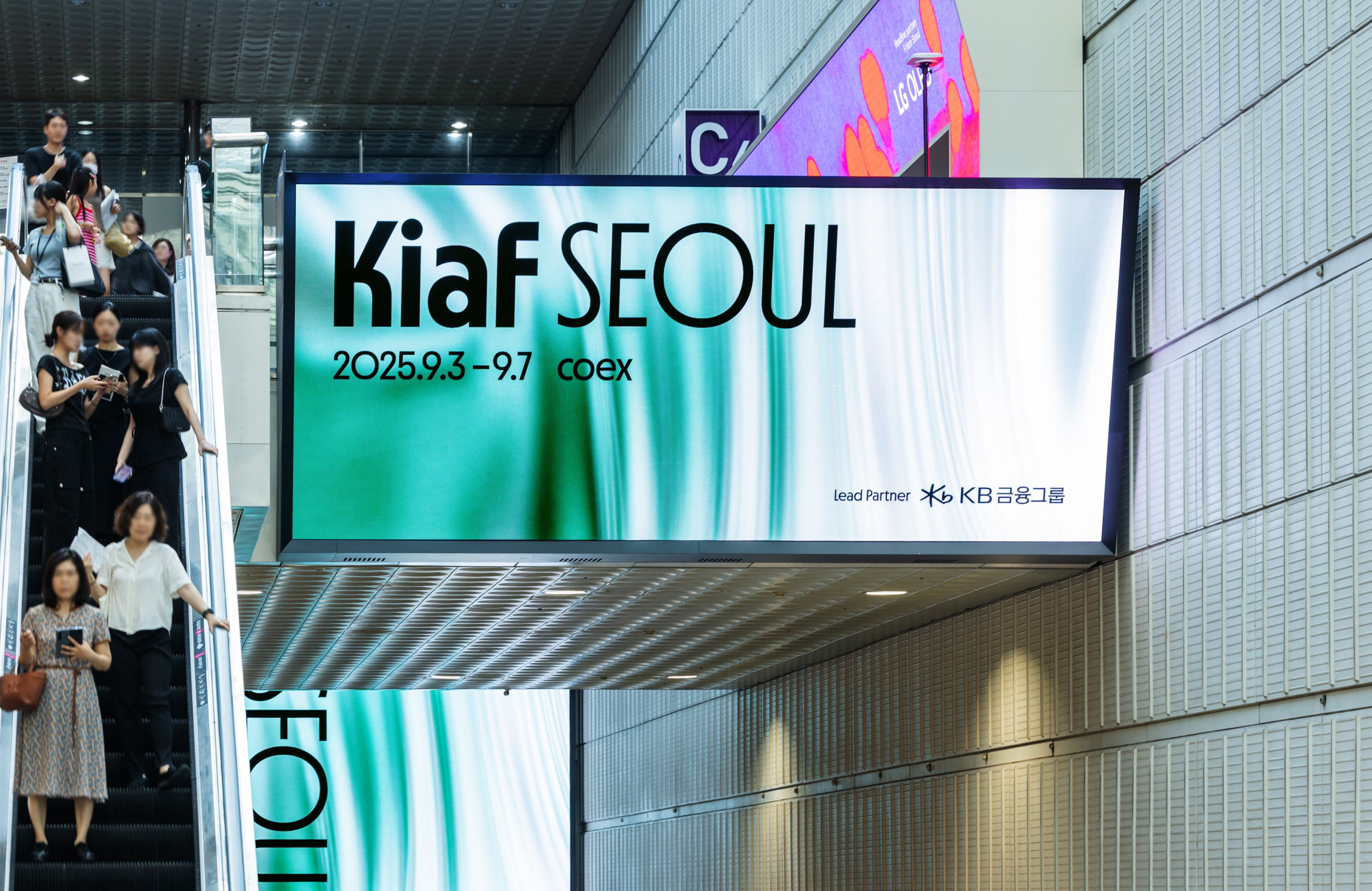
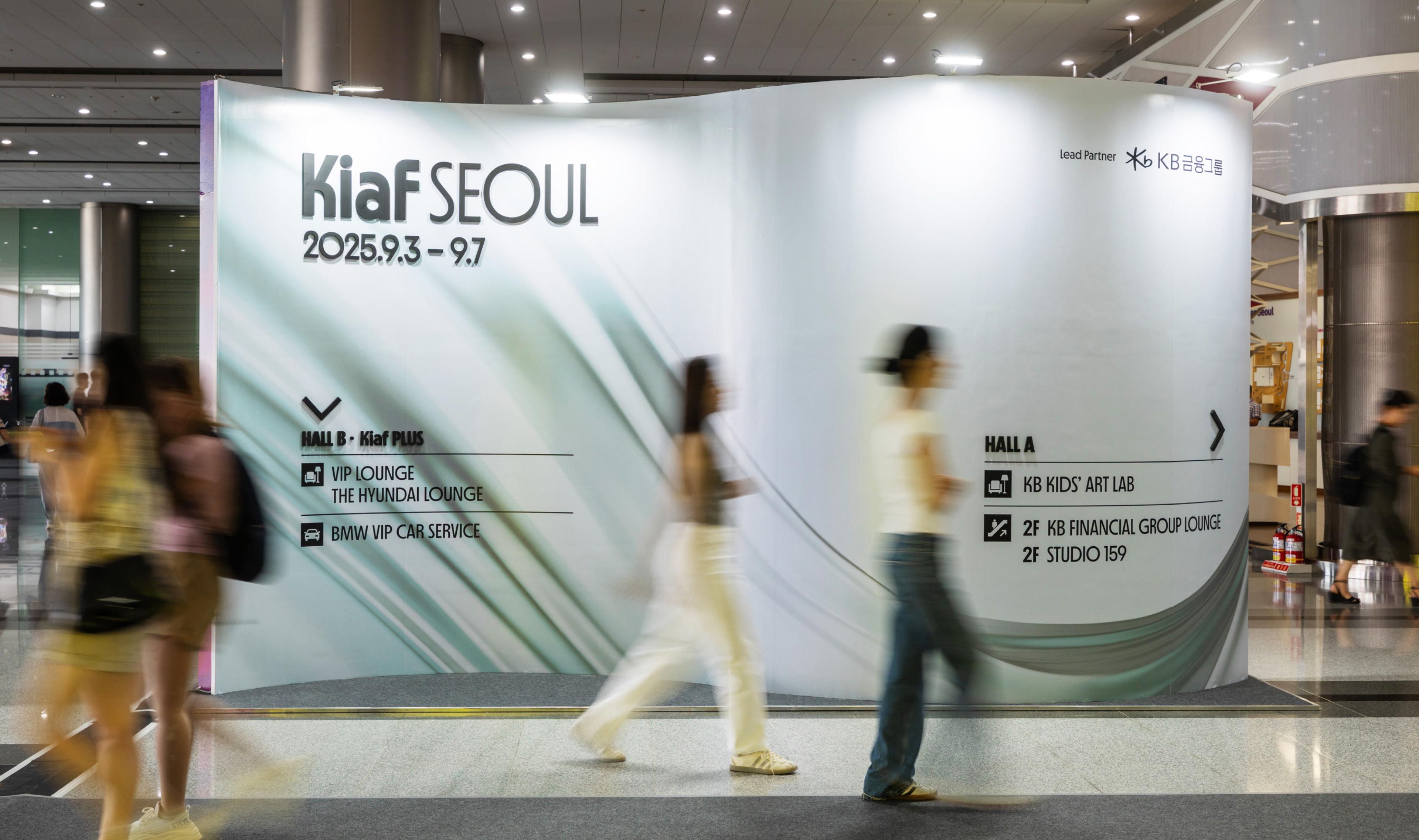
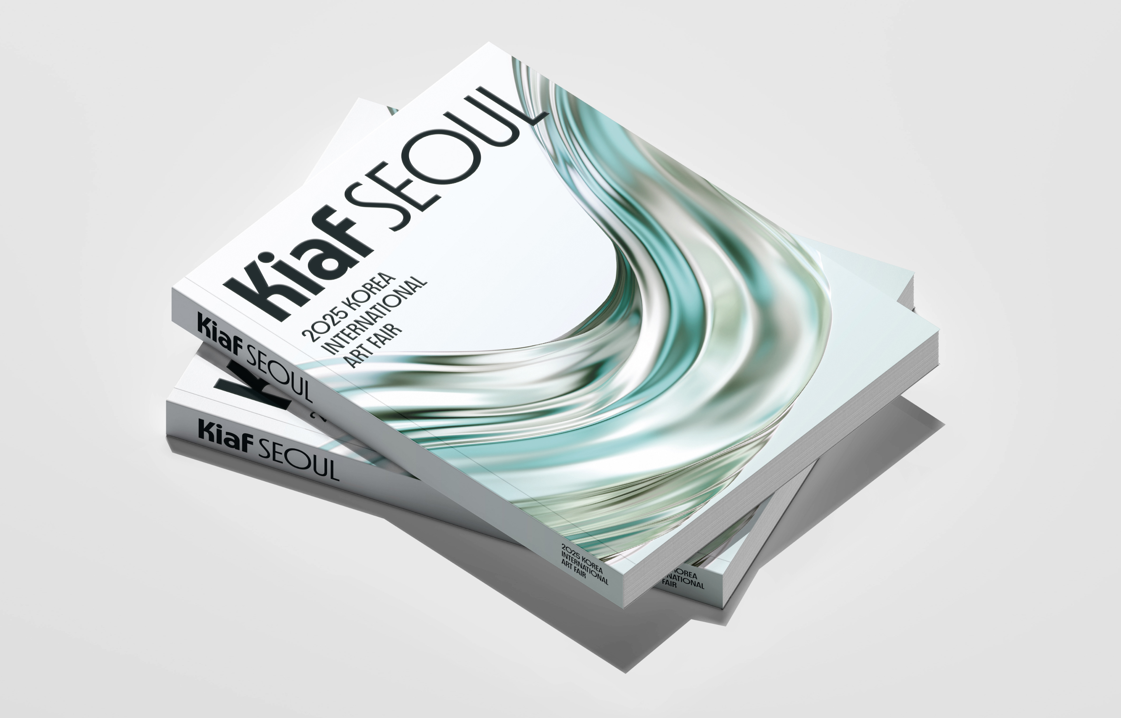
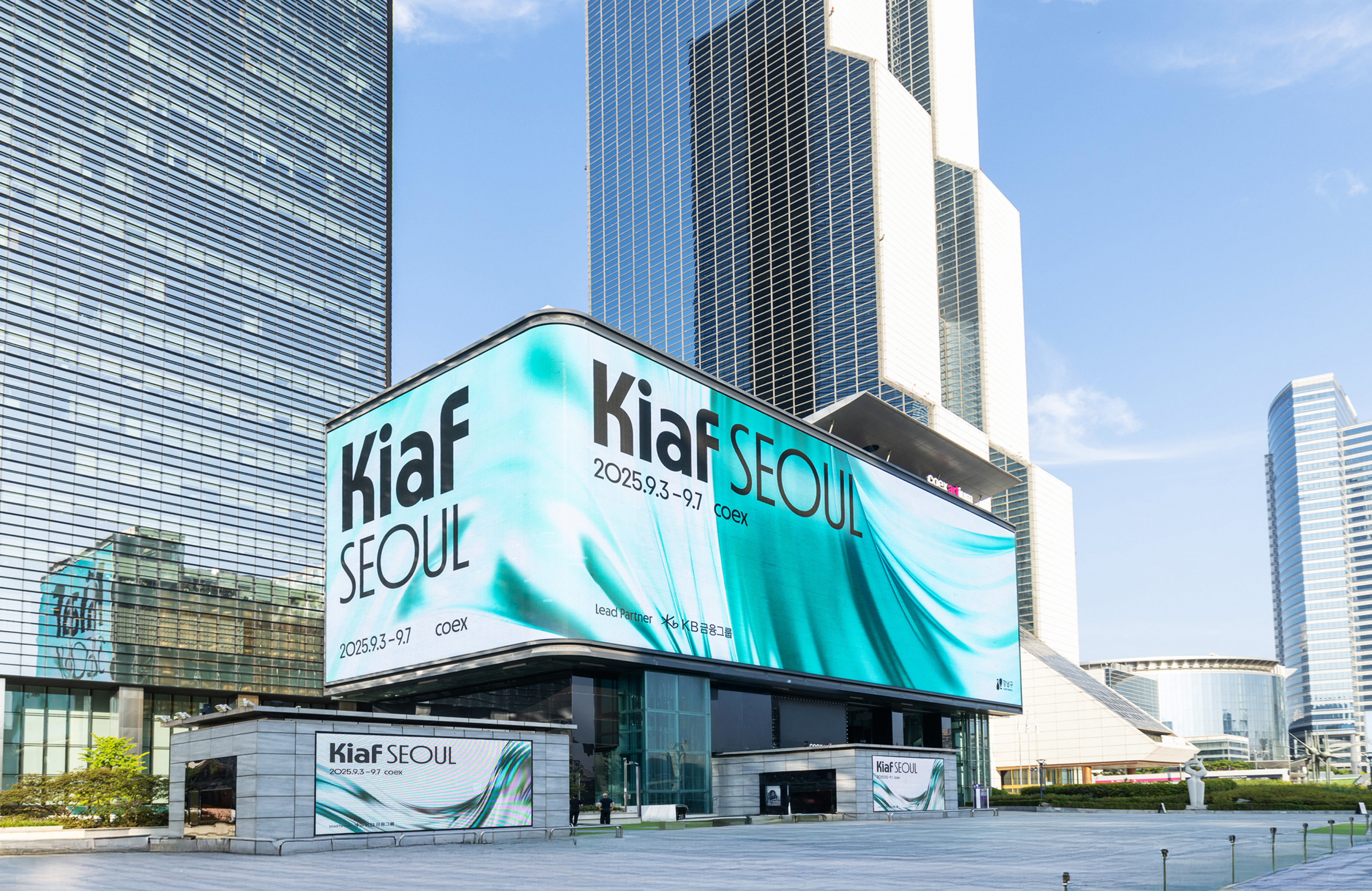
스튜디오사월은 Kiaf SEOUL 2025의 비주얼 아이덴티티를 총괄하였습니다. 이번 프로젝트는 예술이 지닌 유연한 흐름과 감정의 연속성을 시각화하며, Kiaf 2025의 핵심 테마인 ‘공진(Resonance)’의 철학을 담아내는 데 주력했습니다. 2024년의 크롬 오브제가 강렬한 충돌과 긴장 속에서 발생하는 에너지를 표현했다면, 2025년은 그 에너지가 서서히 풀리며 서로의 파동을 수용하고 울림을 확장하는 과정을 섬세하게 담아냈습니다. 키비주얼 “Liquid Continuum”은 예술이 지닌 회복력과 공명의 힘을 조명하며, 갤러리와 작가, 컬렉터, 연계 기관 등 다양한 주체들이 서로의 목소리에 귀 기울이고 건강한 성장의 장을 만들어가는 과정을 시각화합니다.
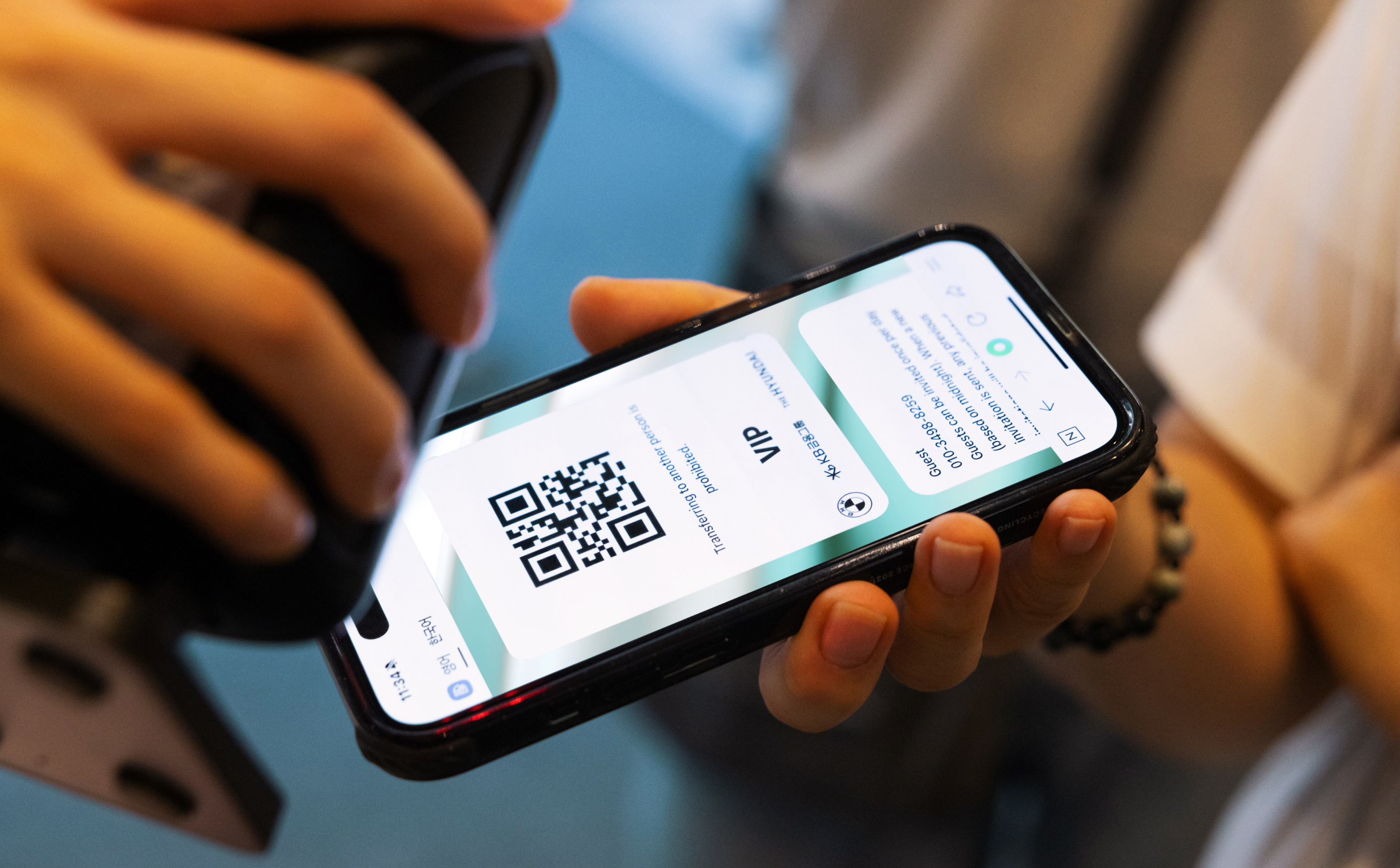
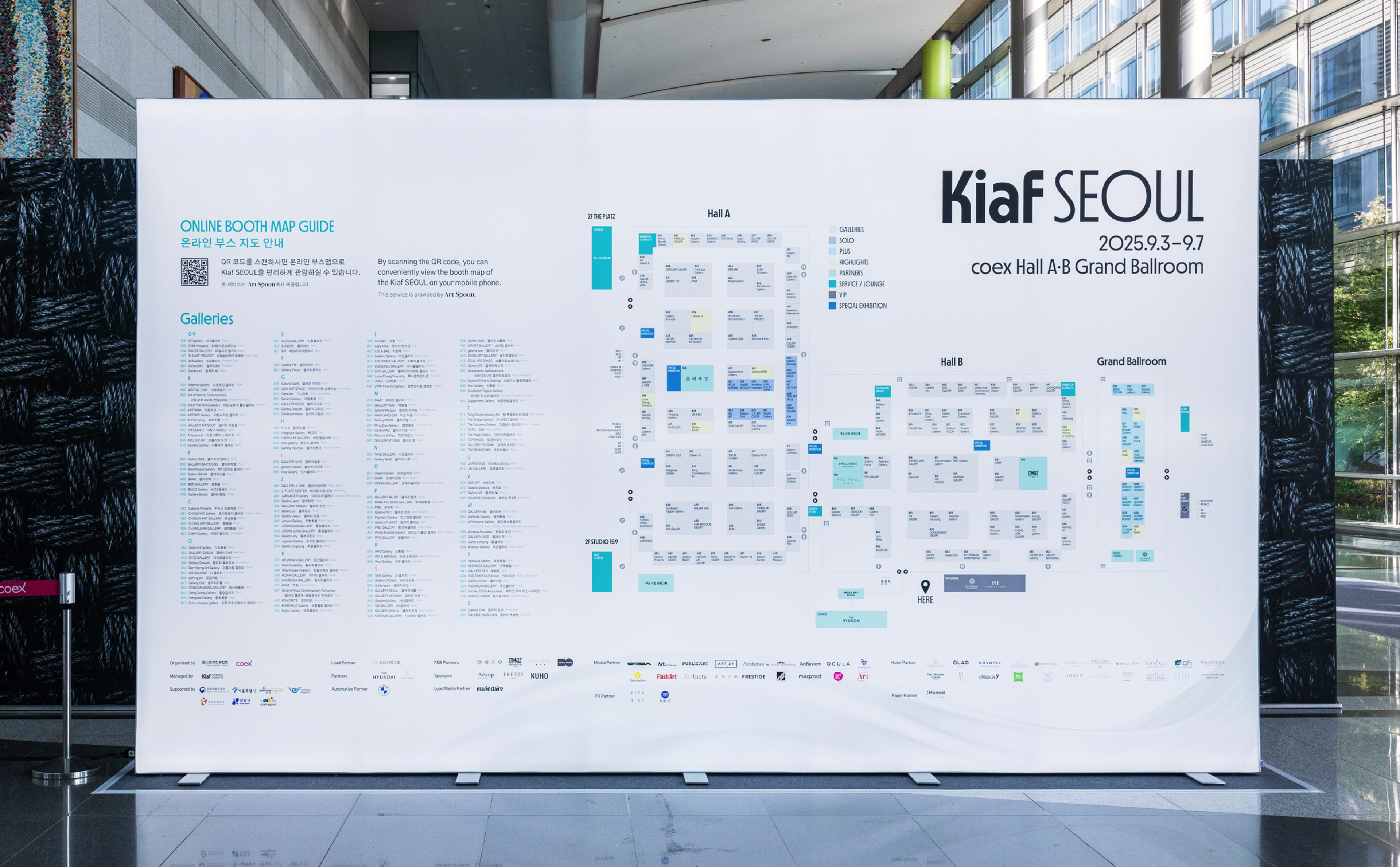
비주얼은 금속적 질감에서 부드러운 굴절과 흐름으로 전환되며, 역동적인 움직임과 변화를 감각적으로 체험할 수 있도록 설계되었습니다. 또한 생명력 있는 에메랄드 톤은 예술의 회복력과 공존의 태도를 은유하며, Kiaf가 지향하는 열린 예술 생태계를 상징적으로 드러냅니다. 본 프로젝트는 키비주얼을 중심으로 현장 그래픽과 디지털 콘텐츠 전반에 확장 적용되어, Kiaf SEOUL의 브랜드 내러티브와 동시대 미술 시장에서의 시각적 존재감을 한층 강화하였습니다.
비주얼은 금속적 질감에서 부드러운 굴절과 흐름으로 전환되며, 역동적인 움직임과 변화를 감각적으로 체험할 수 있도록 설계되었습니다. 또한 생명력 있는 에메랄드 톤은 예술의 회복력과 공존의 태도를 은유하며, Kiaf가 지향하는 열린 예술 생태계를 상징적으로 드러냅니다. 본 프로젝트는 키비주얼을 중심으로 현장 그래픽과 디지털 콘텐츠 전반에 확장 적용되어, Kiaf SEOUL의 브랜드 내러티브와 동시대 미술 시장에서의 시각적 존재감을 한층 강화하였습니다.
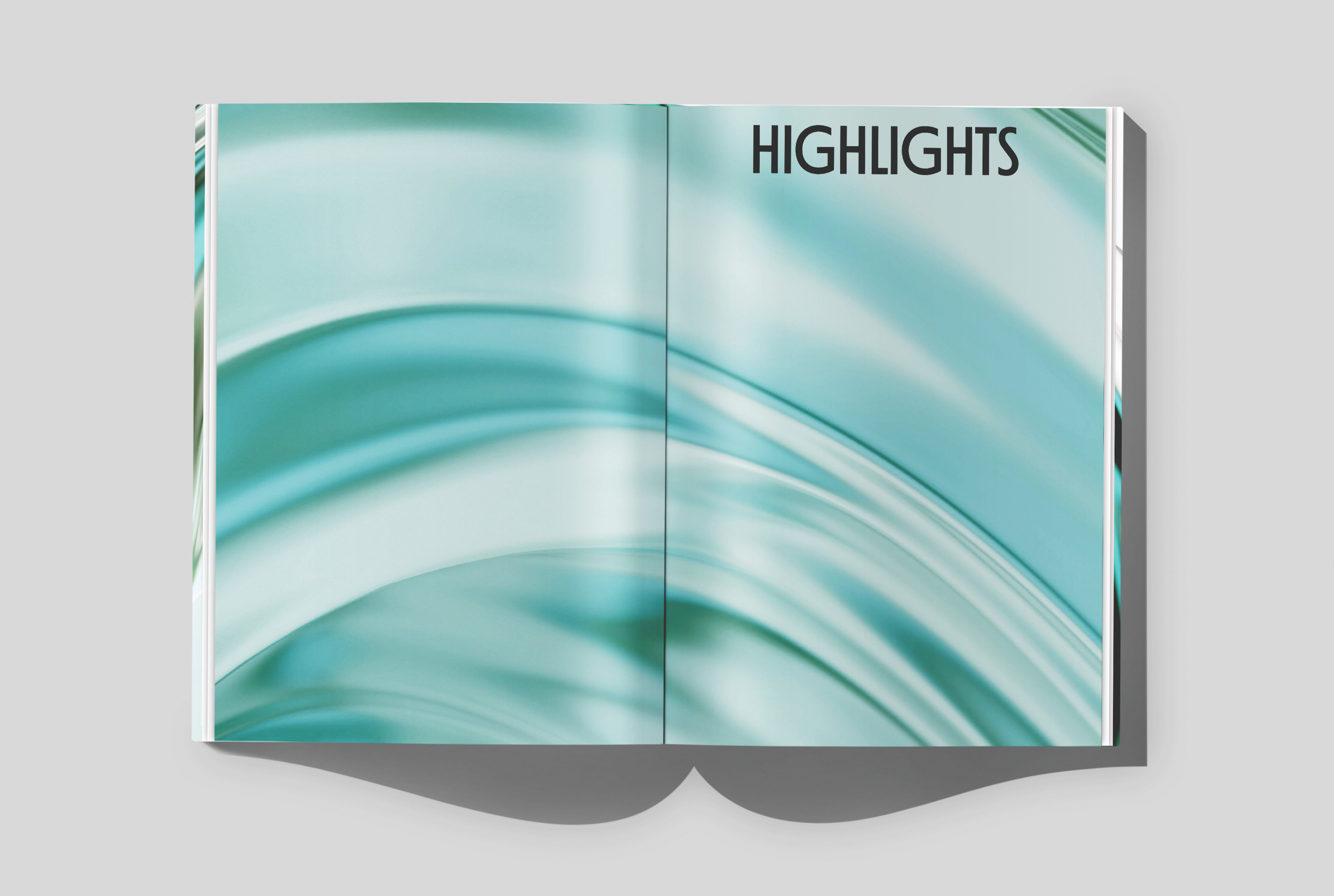
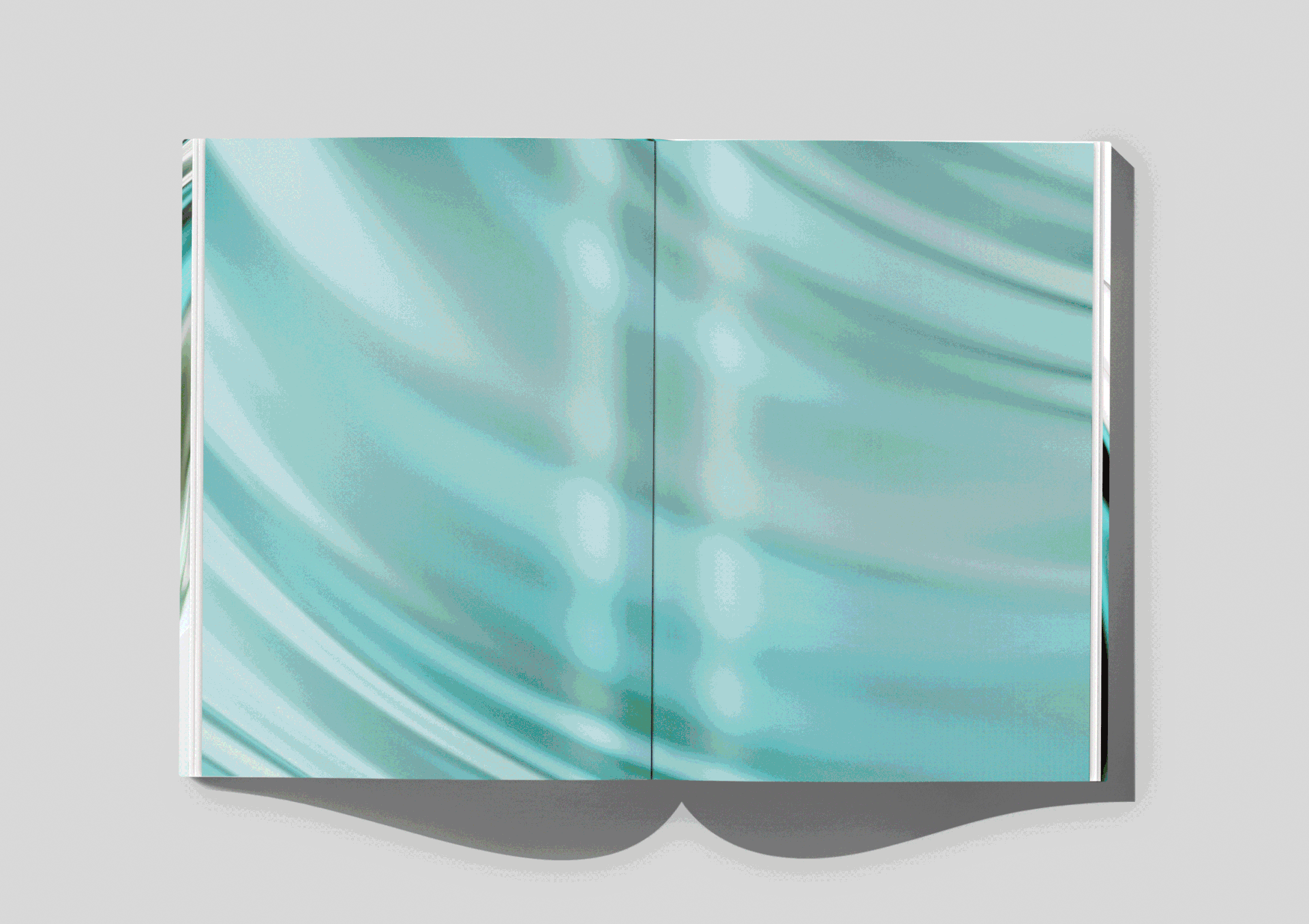
Studio Saworl directed the visual identity of Kiaf SEOUL 2025. This project focused on visualizing the fluidity of art and the continuity of emotions, while embodying the philosophy of Kiaf 2025’s central theme, Resonance.
Whereas the chrome object of 2024 expressed the energy born from intense clashes and tensions, the 2025 identity delicately captures the process of that energy gradually unfolding, embracing each other’s waves, and expanding into resonance. The key visual, Liquid Continuum, highlights the resilience and power of resonance in art, visualizing a space where galleries, artists, collectors, and affiliated institutions listen to one another and foster healthy growth together.
The visual language shifts from metallic textures to soft refractions and flowing movements, designed to evoke a sensory experience of dynamism and subtle transformation. The vibrant emerald tones metaphorically represent the restorative power of art and an attitude of attentive coexistence, symbolizing Kiaf’s vision of an open and inclusive art ecosystem. Centered on the key visual, the identity was extended across on-site graphics and digital content, further strengthening Kiaf SEOUL’s brand narrative and its visual presence within the contemporary art market.
CLIENT
Galleries Association of Korea
DATE
2025.09
3D & MOTION
Cheongbo Park
Galleries Association of Korea
DATE
2025.09
3D & MOTION
Cheongbo Park
Sujin Yang