
SWICY - Sweet & Spicy Buldak
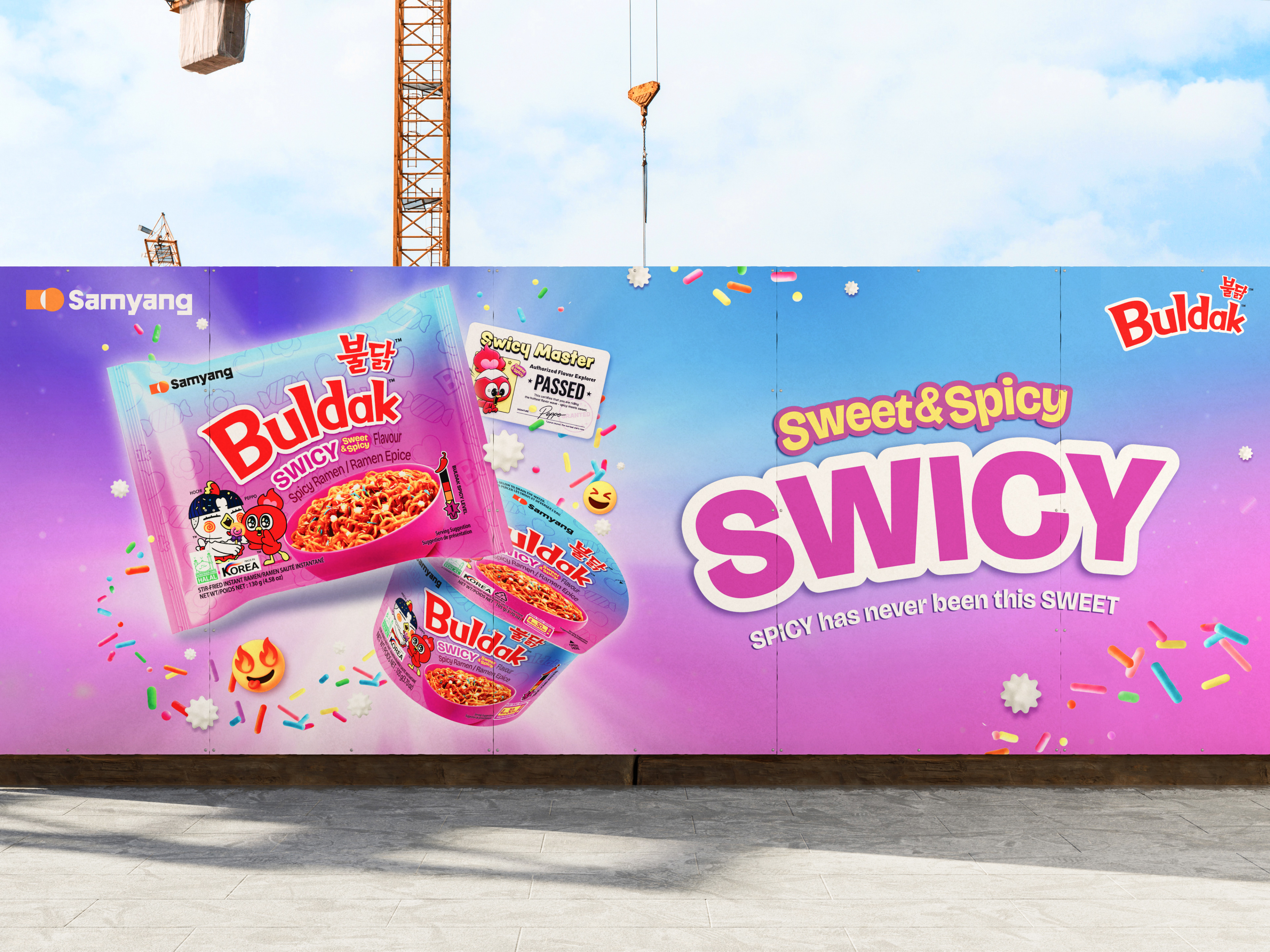
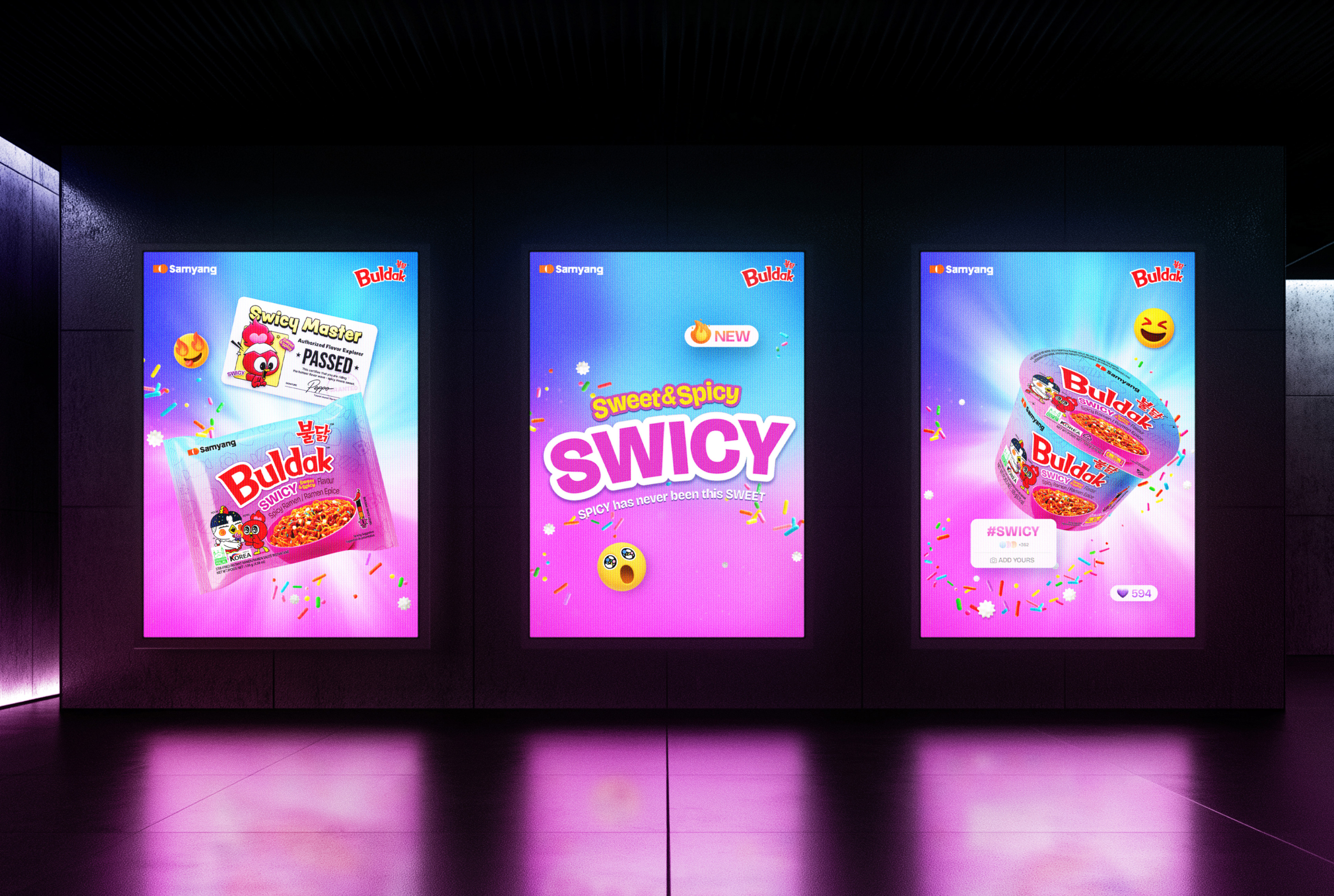
불닭볶음면의 새로운 제품, '스와이시(SWICY)'의 키비주얼 디자인 프로젝트입니다. 맵기의 대명사였던 불닭이 처음으로 '달콤함'을 이야기하는 만큼, 기존의 강렬하고 자극적인 톤앤매너에서 벗어나 보다 유쾌하고 경쾌한 비주얼 언어를 구축하는 데 집중했습니다.
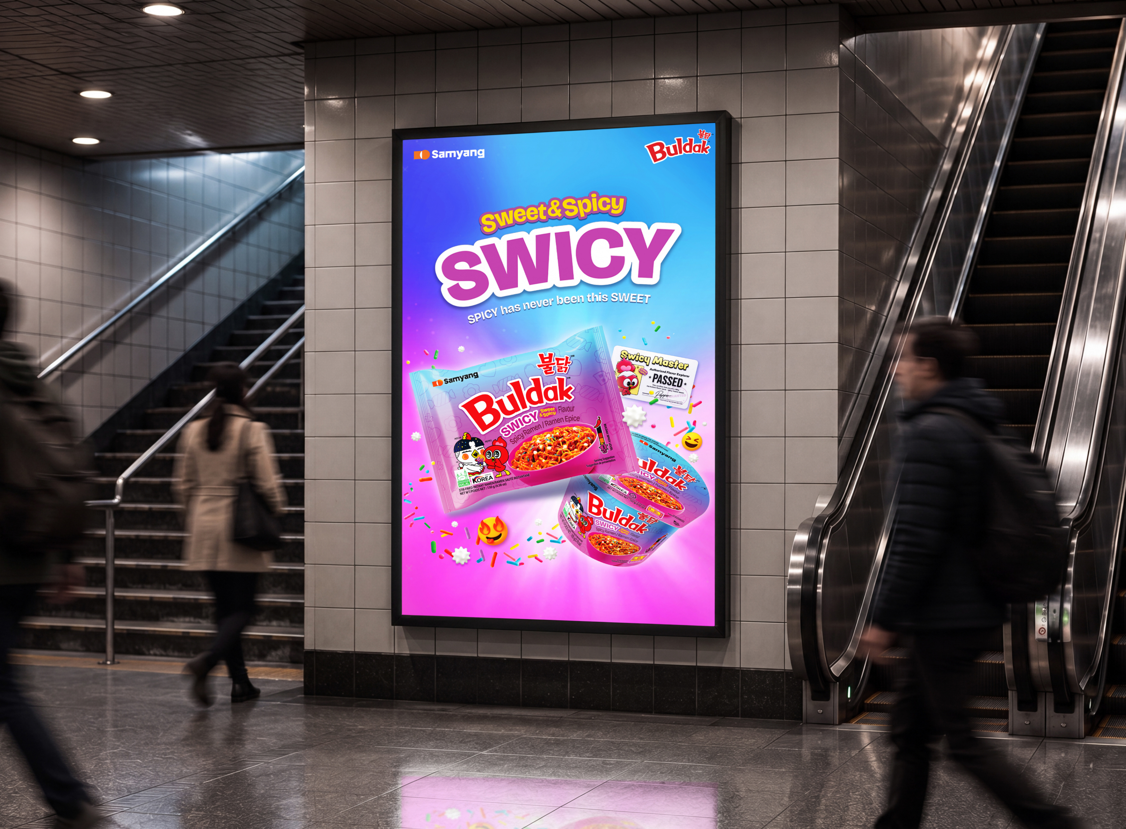
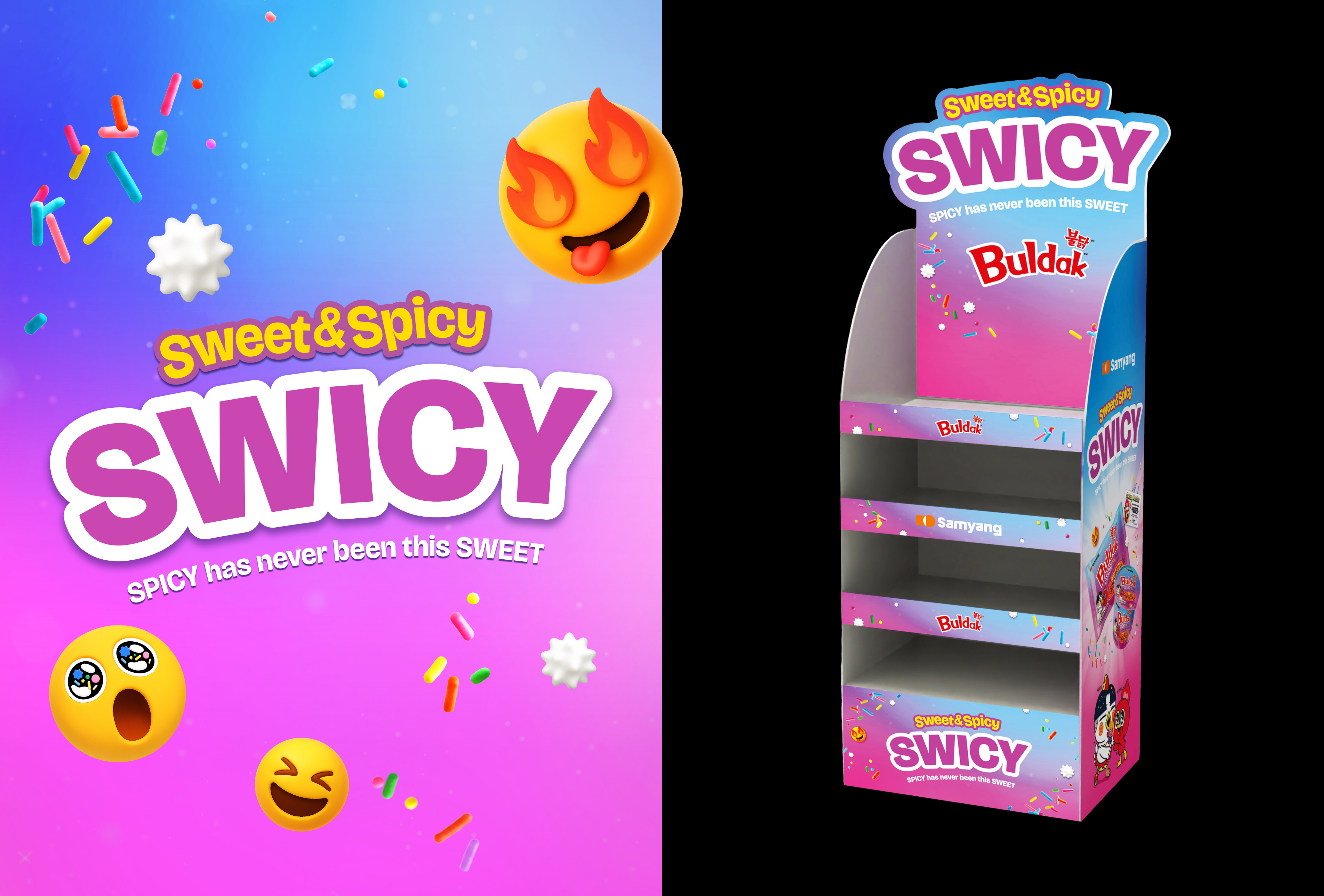
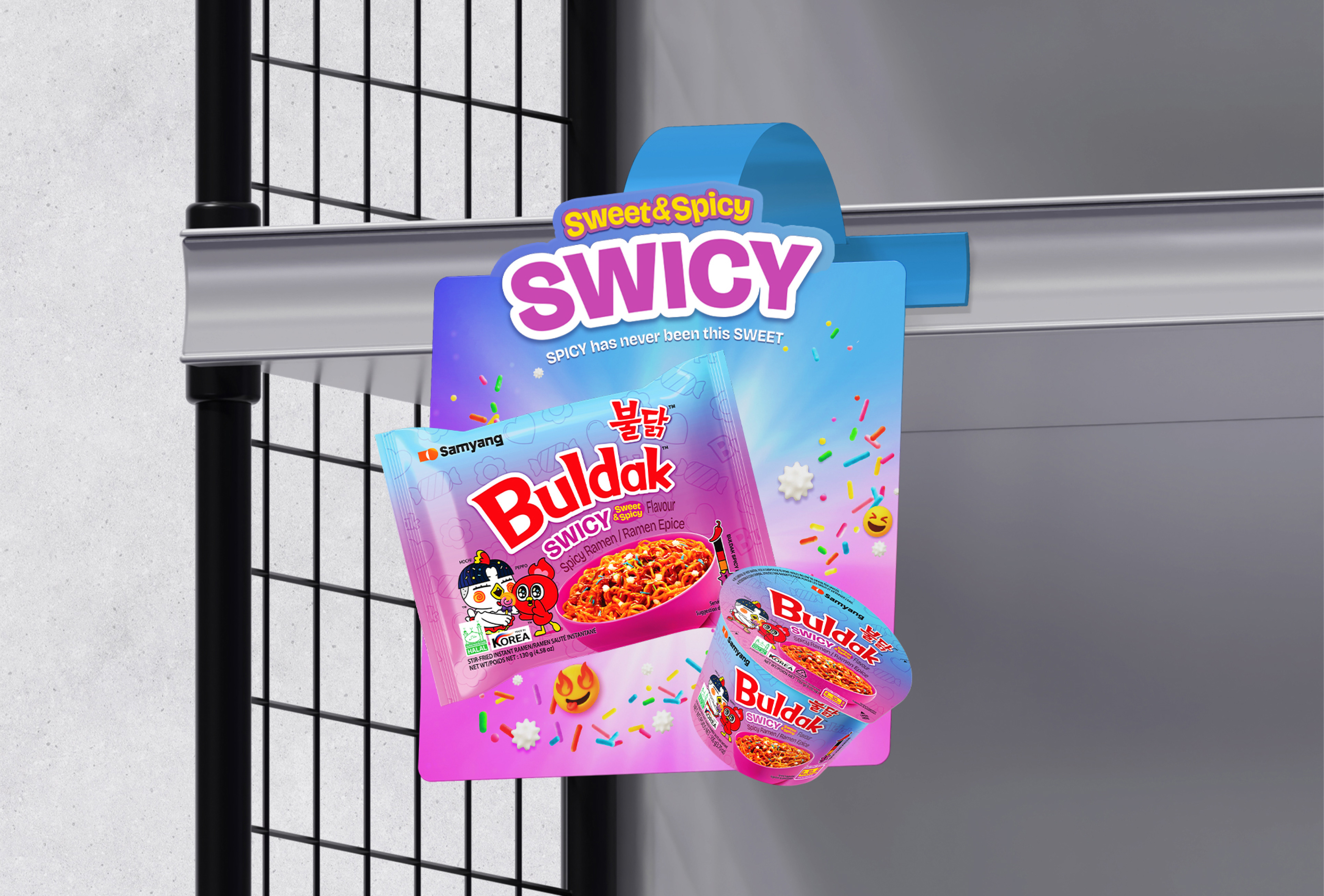
해외 10-20대 젊은 소비자를 핵심 타겟으로 설정해, 기존의 강렬한 톤앤매너에서 벗어나 유쾌하고 경쾌한 비주얼 언어를 구축했습니다. 블루에서 핑크로 이어지는 그라데이션 배경은 Spicy와 Sweet, 두 상반된 매력이 만나는 지점을 색으로 표현한 장치입니다. 화면 곳곳에 흩날리는 스프링클과 캔디 오브젝트는 제품의 '달콤함'을 직관적으로 전달하는 동시에, 파티와 같은 들뜬 분위기를 연출합니다. 이모지 형태의 그래픽 요소와 매운맛 챌린지를 상징하는 'Swicy Master' 인증 배지 등 SNS 세대에게 친숙한 비주얼 문법으로 브랜드 메시지를 풀어냈습니다.
해외 10-20대 젊은 소비자를 핵심 타겟으로 설정해, 기존의 강렬한 톤앤매너에서 벗어나 유쾌하고 경쾌한 비주얼 언어를 구축했습니다. 블루에서 핑크로 이어지는 그라데이션 배경은 Spicy와 Sweet, 두 상반된 매력이 만나는 지점을 색으로 표현한 장치입니다. 화면 곳곳에 흩날리는 스프링클과 캔디 오브젝트는 제품의 '달콤함'을 직관적으로 전달하는 동시에, 파티와 같은 들뜬 분위기를 연출합니다. 이모지 형태의 그래픽 요소와 매운맛 챌린지를 상징하는 'Swicy Master' 인증 배지 등 SNS 세대에게 친숙한 비주얼 문법으로 브랜드 메시지를 풀어냈습니다.
This is a key visual design project for Buldak's new product, 'SWICY.' As Buldak—long synonymous with intense spiciness—speaks to 'sweetness' for the first time, we focused on building a more playful and upbeat visual language, moving away from the brand's traditionally bold and intense tone and manner.
With overseas consumers in their teens and twenties as the core target, we moved away from the intense tone and manner and built a playful, upbeat visual language. The gradient background transitioning from blue to pink is a device that translates the meeting point of two contrasting appeals—Spicy and Sweet—into color. Sprinkles and candy objects scattered throughout the screen intuitively convey the product's 'sweetness' while creating a festive, upbeat mood. Emoji-style graphic elements and the 'Swicy Master' certification badge, symbolizing the spicy-taste challenge, unfold the brand message through a visual grammar familiar to the SNS generation.
With overseas consumers in their teens and twenties as the core target, we moved away from the intense tone and manner and built a playful, upbeat visual language. The gradient background transitioning from blue to pink is a device that translates the meeting point of two contrasting appeals—Spicy and Sweet—into color. Sprinkles and candy objects scattered throughout the screen intuitively convey the product's 'sweetness' while creating a festive, upbeat mood. Emoji-style graphic elements and the 'Swicy Master' certification badge, symbolizing the spicy-taste challenge, unfold the brand message through a visual grammar familiar to the SNS generation.
CLIENT
Samyangfoods
DATE
2026.01
Samyangfoods
DATE
2026.01